Big Chains, Bigger Opportunities: How Local Optical Stores Can Thrive
BLOG
Big Chains, Bigger Opportunities
How Local Optical Stores Can Thrive
Give color power to your exquisite designs
Part 01: Simple guide to help local opticians
Big Chains, Bigger Opportunities: How Local Optical Stores Can Thrive
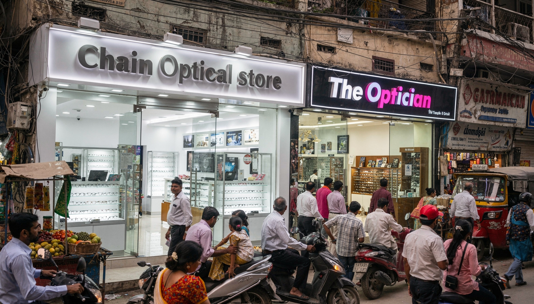
The rapid expansion of major optical chains like Lenskart and Titan Eye+ has sparked concern among many independent optical retailers. When a big-name brand opens nearby, it’s easy to assume your business will take a hit.
But here’s the good news: their presence can actually drive more customers to your doorstep – if you know how to turn competition into opportunity.
This blog is here to show you how. With the right mindset and smart strategies, you can turn the buzz and footfall generated by big brands into a steady stream of loyal customers for your own business.
Give color power to your exquisite designs
Give color power to your exquisite designs
Big Brands Bring Traffic to Your Neighborhood
Large optical chains invest heavily in marketing – billboards, digital ads, influencer campaigns, and aggressive promotions. This creates buzz and draws more people to your area.
Many of these customers don’t just walk into the chain store – they explore nearby shops to compare prices, styles, and service. That means more walk-ins for you, without spending a rupee on advertising.
Big Chains Bigger Opportunities: How Local Optical Stores Can Thrive

Big Chains Bigger Opportunities: How Local Optical Stores Can Thrive
Why Customers Still Choose Local Optical Stores
Despite the glitz of big brands, local optical stores offer something invaluable: trust and personal connection. Here’s what sets you apart:
- Flexible pricing tailored to your customers’ budgets
- Frame selections that reflect local tastes and preferences
- Genuine advice without sales pressure
- Direct involvement of the owner, not just staff
In India, relationships matter. People prefer buying from someone they know and trust – especially when it comes to their eyes.
-
- 60-30-10 rule: This states 60% of the design should be covered with dominant color, 30% with secondary color or texture, and 10% with an accent.
Generally, the dominant and secondary colors should be neutral colors and you should use the accent color for highlighting and making things stand out in your design. Like we can have a red CTA (call to action) in a white, black design. - Tweaking your colors: Now as you have applied the rule to select the colors in your design, you can now make changes in the colors by using their variations.
Use and make them appealing, there is no rule as to what will appeal, you can use as many variations as you want as per the requirements. - Consistency with the colors: Now as you have made one design with the color pallet. Stick to this color pallet to use it in all your designs with variations only if needed. This will help you establish a brand presence.
- 60-30-10 rule: This states 60% of the design should be covered with dominant color, 30% with secondary color or texture, and 10% with an accent.
Give color power to your exquisite designs
Give color power to your exquisite designs

Give color power to your exquisite designs
Give color power to your exquisite designs
-
- 60-30-10 rule: This states 60% of the design should be covered with dominant color, 30% with secondary color or texture, and 10% with an accent.
Generally, the dominant and secondary colors should be neutral colors and you should use the accent color for highlighting and making things stand out in your design. Like we can have a red CTA (call to action) in a white, black design. - Tweaking your colors: Now as you have applied the rule to select the colors in your design, you can now make changes in the colors by using their variations.
Use and make them appealing, there is no rule as to what will appeal, you can use as many variations as you want as per the requirements. - Consistency with the colors: Now as you have made one design with the color pallet. Stick to this color pallet to use it in all your designs with variations only if needed. This will help you establish a brand presence.
- 60-30-10 rule: This states 60% of the design should be covered with dominant color, 30% with secondary color or texture, and 10% with an accent.
Give color power to your designs
Give color power to your designs
-
- 60-30-10 rule: This states 60% of the design should be covered with dominant color, 30% with secondary color or texture, and 10% with an accent.
Generally, the dominant and secondary colors should be neutral colors and you should use the accent color for highlighting and making things stand out in your design. Like we can have a red CTA (call to action) in a white, black design. - Tweaking your colors: Now as you have applied the rule to select the colors in your design, you can now make changes in the colors by using their variations.
Use and make them appealing, there is no rule as to what will appeal, you can use as many variations as you want as per the requirements. - Consistency with the colors: Now as you have made one design with the color pallet. Stick to this color pallet to use it in all your designs with variations only if needed. This will help you establish a brand presence.
- 60-30-10 rule: This states 60% of the design should be covered with dominant color, 30% with secondary color or texture, and 10% with an accent.
Give color power to your designs
How to select powerful colors for your designs
Give color power to your designs
How to select powerful colors for your designs
-
- 60-30-10 rule: This states 60% of the design should be covered with dominant color, 30% with secondary color or texture, and 10% with an accent.
Generally, the dominant and secondary colors should be neutral colors and you should use the accent color for highlighting and making things stand out in your design. Like we can have a red CTA (call to action) in a white, black design. - Tweaking your colors: Now as you have applied the rule to select the colors in your design, you can now make changes in the colors by using their variations.
Use and make them appealing, there is no rule as to what will appeal, you can use as many variations as you want as per the requirements. - Consistency with the colors: Now as you have made one design with the color pallet. Stick to this color pallet to use it in all your designs with variations only if needed. This will help you establish a brand presence.
- 60-30-10 rule: This states 60% of the design should be covered with dominant color, 30% with secondary color or texture, and 10% with an accent.
How to select powerful colors for your designs
Give color power to your designs
Give color power to your designs
How to select powerful colors for your designs
Give color power to your designs
How to select powerful colors for your designs
- Analogous Harmony:
When viewed together, these colors give a pleasing, serene appearance. These colors are present next to each other on the color wheel.
The most common example is violet, red-violet, and red. These 3 colors represent analogous harmonies. In lay mans language little bit of shade right and left on the color wheel. - Complementary Harmony:
Contrasting colors are often termed complementary harmonies. They are present on the opposite side of the color wheel. Red and green are the most common example of this kind of harmony. - Split-Complementary Harmony:
Using one base color and 2 complementary colors are generally termed as Split complementary colors. Here instead of one complementary color, two colors are picked symmetrically around it on the color wheel. e.g Orange, Blue-green, Blue-purple - Triadic Harmony:
Here we select three colors located at equal distances from each other on the color wheel. These selected colors are evenly spaced throughout the wheel. These color often creates a pleasing set of appearance when used together. e.g. Primary colors – red, blue, and yellow. - Monochromatic Harmony:
Selecting colors from a hue, and its various tints, tones, and shades associated. Shades are sometimes been derived by adding a tint of white, grey, and black to make a pallet.
- Analogous Harmony:
Give color power to your designs
How to select powerful colors for your designs
Give color power to your designs
How to select powerful colors for your designs
- Analogous Harmony:
When viewed together, these colors give a pleasing, serene appearance. These colors are present next to each other on the color wheel.
The most common example is violet, red-violet, and red. These 3 colors represent analogous harmonies. In lay mans language little bit of shade right and left on the color wheel. - Complementary Harmony:
Contrasting colors are often termed complementary harmonies. They are present on the opposite side of the color wheel. Red and green are the most common example of this kind of harmony. - Split-Complementary Harmony:
Using one base color and 2 complementary colors are generally termed as Split complementary colors. Here instead of one complementary color, two colors are picked symmetrically around it on the color wheel. e.g Orange, Blue-green, Blue-purple - Triadic Harmony:
Here we select three colors located at equal distances from each other on the color wheel. These selected colors are evenly spaced throughout the wheel. These color often creates a pleasing set of appearance when used together. e.g. Primary colors – red, blue, and yellow. - Monochromatic Harmony:
Selecting colors from a hue, and its various tints, tones, and shades associated. Shades are sometimes been derived by adding a tint of white, grey, and black to make a pallet.
- Analogous Harmony:
Give color power to your designs
How to select powerful colors for your designs
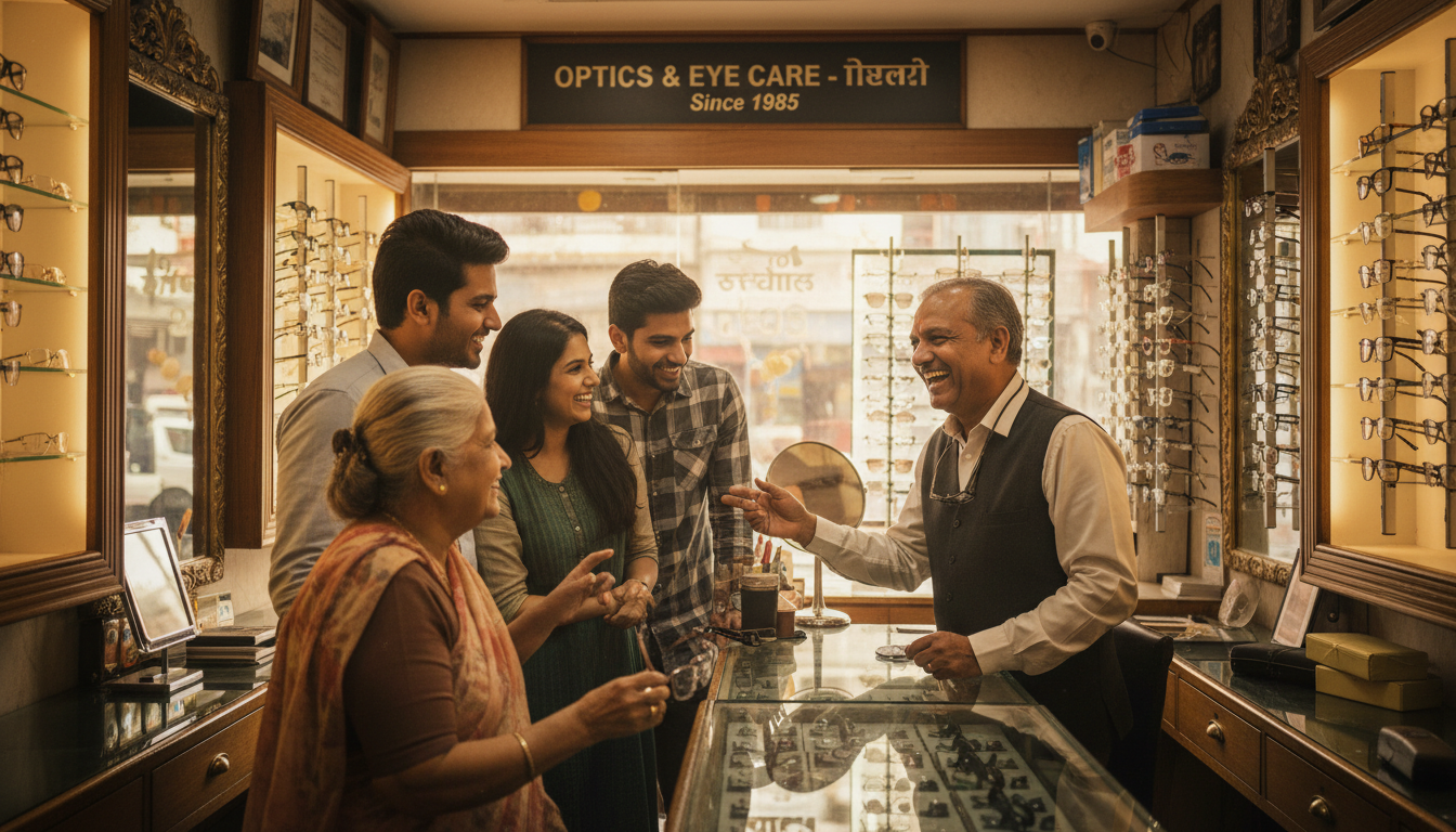
Personalized Service Is Your Superpower
What keeps customers coming back isn’t just the product – it’s the experience. Your store offers:
- Thoughtful follow-ups and adjustments
- Personalized recommendations
- After-sales support that builds loyalty
This level of care is hard for large chains to replicate, no matter how many outlets they open.

Big Chains Bigger Opportunities: How Local Optical Stores Can Thrive

Big Chains Bigger Opportunities: How Local Optical Stores Can Thrive
Stock Smart, Not Big
Trying to mimic big brands by stocking only expensive, high-end labels can backfire. Instead, focus on what your local market actually wants:
- Products that match local spending habits
- Styles suited to the age group and lifestyle of your customers
- Everyday eyewear that’s practical and affordable
Avoid over-investing in slow-moving, high-cost inventory that ties up your working capital.
Learn from the Big Players
Even the largest chains are shifting focus to private labels and for good reason:
- Higher profit margins
- Competitive pricing
- Better control over quality and supply
This strategy works for them and it can work for you too.

Big Chains Bigger Opportunities: How Local Optical Stores Can Thrive

Big Chains Bigger Opportunities: How Local Optical Stores Can Thrive
Build Your Own Trusted Brand
You already have what big brands are trying to build:
- A loyal customer base
- Years of earned trust
- Direct influence over buying decisions
Start by introducing:
- Carefully selected unbranded frames
- Your own in-house or preferred labels
- Value-for-money options you confidently recommend
Your advice carries more weight than a scripted pitch from a chain store employee.
How to Create a Captivating Social Media Post
How to Create a Captivating Social Media Post
How to Create a Captivating Social Media Post
How to Create a Captivating Social Media Post
Confidence Is Contagious
When you believe in your products and service, your customers will too. Big brands rely on systems and scale. You have something more powerful – experience and relationships.
Trust your instincts. Trust your store. Trust your service.
How to Create a Captivating Social Media Post
How to Create a Captivating Social Media Post
How to Create a Captivating Social Media Post
How to Create a Captivating Social Media Post
Big Chains Bigger Opportunities: How Local Optical Stores Can Thrive
Final Word: See Competition as a Catalyst
Big optical chains aren’t your enemy – they’re your opportunity. They bring more customers to your area. With the right product mix, honest pricing, and personalized service, your local optical store can not only survive: but thrive.
Give color power to your exquisite designs
Give color power to your exquisite designs
What’s Next: Preparing to Welcome More Customers
You’ve learned how to turn competition from big optical chains into an opportunity. The next step is preparing your store to make the most of the extra foot traffic.
In our upcoming blogs, we’ll share practical tips on how to get your shop, your team, and your service ready to impress new customers. From store displays and staff training to creating a great in-store experience and smart follow-up strategies – we’ll cover everything you need.
Stay tuned – it’s going to be all about preparation and growth!
Give color power to your exquisite designs
Give color power to your exquisite designs
The Indian Optical Market: Facts, Figures, and the Big Picture
India’s eyewear market is booming, driven by rising screen time, urbanisation, and growing awareness of eye health. The market is expected to reach ₹1.75 lakh crore by 2027, growing at a compound annual rate of around 8%.
How Many Optical Stores Are There?
- Total opticians in India (2025): 64,595 businesses (Listed)
- Highest concentration by state: Maharashtra (10,048), Uttar Pradesh (6,006), West Bengal (4,928), Gujarat (4,374), Tamil Nadu (3,472), Delhi (3,272), Karnataka (3,105), Telangana (2,588), Kerala (2,457), Rajasthan (2,301)
- Top cities by number of opticians:
Note: These numbers reflect a vibrant, competitive market with plenty of room for both chains and independents.
Major Optical Chains: Store Counts Across India
- Lenskart: Over 2,137 stores in India (as of June 2025), present in 431 cities
- Titan Eye+: 871 exclusive stores as of September 2025, present in 384 cities
- Vision Express (Reliance): 160+ stores in 30+ cities
- Himalaya Optical: 100+ stores nationwide
- Gangar Eyenation: 60+ stores, mainly in western and southern India
- Lawrence & Mayo: 100+ outlets in 30 cities
- Specsmakers: 250+ stores, strong presence in South India
Key takeaway: Big chains are expanding rapidly, but independent stores still make up the majority of the market.
How to Create a Captivating Social Media Post
How to Create a Captivating Social Media Post
How to Create a Captivating Social Media Post
How to Create a Captivating Social Media Post
How to Create a Captivating Social Media Post
How to Create a Captivating Social Media Post
How to Create a Captivating Social Media Post
How to Create a Captivating Social Media Post
Disclaimer:
This blog is created for general informational purposes only. The facts, figures, and insights shared are based on publicly available data and industry observations. They should not be considered financial, legal, or professional advice. Optical store owners are encouraged to use their own judgment and consult relevant experts before making business decisions.
Images used in this blog may have been generated with the help of artificial intelligence. These visuals are illustrative in nature and do not represent actual stores, products, or individuals. While every effort has been made to ensure accuracy and clarity, the author does not guarantee completeness or assume responsibility for outcomes based on this content.