Preparing to Welcome More Customers
BLOG
Simple guide to help local opticians
Preparing to Welcome More Customers
Give color power to your exquisite designs
Part 02: Simple guide to help local opticians
Preparing to Welcome More Customers
Make your store unmistakable: sharpen the facade with a visible “Year of Excellence,” keep displays curated and clutter-free, and turn waiting time into a selling moment with digital browsing and small comforts. These focused moves boost trust, dwell time, and conversions against new chains.
Give color power to your exquisite designs
Give color power to your exquisite designs
Why small details win
When optical chains open nearby, local trust and experience become your strongest differentiators. Small, consistent upgrades to facade, merchandising, accessibility, and aftercare create a human-centered experience that big chains struggle to match.

Big Chains Bigger Opportunities: Preparing to Welcome More Customers

Big Chains Bigger Opportunities: Preparing to Welcome More Customers
Facade and first visual impact
- Year of excellence: add a concise line like Serving Since 2002 to the facade to signal longevity and credibility.
- Clean signage & brand consistency: use readable type, consistent colors, and a tidy logo to make the store legible from the street.
- Well-lit, uncluttered window: present one clear story per window; avoid overcrowding and rotate the story monthly to stay relevant.
-
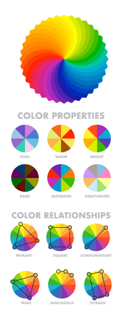
- 60-30-10 rule: This states 60% of the design should be covered with dominant color, 30% with secondary color or texture, and 10% with an accent.
Generally, the dominant and secondary colors should be neutral colors and you should use the accent color for highlighting and making things stand out in your design. Like we can have a red CTA (call to action) in a white, black design. - Tweaking your colors: Now as you have applied the rule to select the colors in your design, you can now make changes in the colors by using their variations.
Use and make them appealing, there is no rule as to what will appeal, you can use as many variations as you want as per the requirements. - Consistency with the colors: Now as you have made one design with the color pallet. Stick to this color pallet to use it in all your designs with variations only if needed. This will help you establish a brand presence.
- 60-30-10 rule: This states 60% of the design should be covered with dominant color, 30% with secondary color or texture, and 10% with an accent.
Give color power to your exquisite designs
Give color power to your exquisite designs

Give color power to your exquisite designs
Give color power to your exquisite designs
-
- 60-30-10 rule: This states 60% of the design should be covered with dominant color, 30% with secondary color or texture, and 10% with an accent.
Generally, the dominant and secondary colors should be neutral colors and you should use the accent color for highlighting and making things stand out in your design. Like we can have a red CTA (call to action) in a white, black design. - Tweaking your colors: Now as you have applied the rule to select the colors in your design, you can now make changes in the colors by using their variations.
Use and make them appealing, there is no rule as to what will appeal, you can use as many variations as you want as per the requirements. - Consistency with the colors: Now as you have made one design with the color pallet. Stick to this color pallet to use it in all your designs with variations only if needed. This will help you establish a brand presence.
- 60-30-10 rule: This states 60% of the design should be covered with dominant color, 30% with secondary color or texture, and 10% with an accent.
Give color power to your designs
Give color power to your designs
-
- 60-30-10 rule: This states 60% of the design should be covered with dominant color, 30% with secondary color or texture, and 10% with an accent.
Generally, the dominant and secondary colors should be neutral colors and you should use the accent color for highlighting and making things stand out in your design. Like we can have a red CTA (call to action) in a white, black design. - Tweaking your colors: Now as you have applied the rule to select the colors in your design, you can now make changes in the colors by using their variations.
Use and make them appealing, there is no rule as to what will appeal, you can use as many variations as you want as per the requirements. - Consistency with the colors: Now as you have made one design with the color pallet. Stick to this color pallet to use it in all your designs with variations only if needed. This will help you establish a brand presence.
- 60-30-10 rule: This states 60% of the design should be covered with dominant color, 30% with secondary color or texture, and 10% with an accent.
Give color power to your designs
How to select powerful colors for your designs
Give color power to your designs
How to select powerful colors for your designs
-
- 60-30-10 rule: This states 60% of the design should be covered with dominant color, 30% with secondary color or texture, and 10% with an accent.
Generally, the dominant and secondary colors should be neutral colors and you should use the accent color for highlighting and making things stand out in your design. Like we can have a red CTA (call to action) in a white, black design. - Tweaking your colors: Now as you have applied the rule to select the colors in your design, you can now make changes in the colors by using their variations.
Use and make them appealing, there is no rule as to what will appeal, you can use as many variations as you want as per the requirements. - Consistency with the colors: Now as you have made one design with the color pallet. Stick to this color pallet to use it in all your designs with variations only if needed. This will help you establish a brand presence.
- 60-30-10 rule: This states 60% of the design should be covered with dominant color, 30% with secondary color or texture, and 10% with an accent.
How to select powerful colors for your designs
Give color power to your designs
Give color power to your designs
How to select powerful colors for your designs
Give color power to your designs
How to select powerful colors for your designs
- Analogous Harmony:
When viewed together, these colors give a pleasing, serene appearance. These colors are present next to each other on the color wheel.
The most common example is violet, red-violet, and red. These 3 colors represent analogous harmonies. In lay mans language little bit of shade right and left on the color wheel. - Complementary Harmony:
Contrasting colors are often termed complementary harmonies. They are present on the opposite side of the color wheel. Red and green are the most common example of this kind of harmony. - Split-Complementary Harmony:
Using one base color and 2 complementary colors are generally termed as Split complementary colors. Here instead of one complementary color, two colors are picked symmetrically around it on the color wheel. e.g Orange, Blue-green, Blue-purple - Triadic Harmony:
Here we select three colors located at equal distances from each other on the color wheel. These selected colors are evenly spaced throughout the wheel. These color often creates a pleasing set of appearance when used together. e.g. Primary colors – red, blue, and yellow. - Monochromatic Harmony:
Selecting colors from a hue, and its various tints, tones, and shades associated. Shades are sometimes been derived by adding a tint of white, grey, and black to make a pallet.
- Analogous Harmony:
Give color power to your designs
How to select powerful colors for your designs
Give color power to your designs
How to select powerful colors for your designs
- Analogous Harmony:
When viewed together, these colors give a pleasing, serene appearance. These colors are present next to each other on the color wheel.
The most common example is violet, red-violet, and red. These 3 colors represent analogous harmonies. In lay mans language little bit of shade right and left on the color wheel. - Complementary Harmony:
Contrasting colors are often termed complementary harmonies. They are present on the opposite side of the color wheel. Red and green are the most common example of this kind of harmony. - Split-Complementary Harmony:
Using one base color and 2 complementary colors are generally termed as Split complementary colors. Here instead of one complementary color, two colors are picked symmetrically around it on the color wheel. e.g Orange, Blue-green, Blue-purple - Triadic Harmony:
Here we select three colors located at equal distances from each other on the color wheel. These selected colors are evenly spaced throughout the wheel. These color often creates a pleasing set of appearance when used together. e.g. Primary colors – red, blue, and yellow. - Monochromatic Harmony:
Selecting colors from a hue, and its various tints, tones, and shades associated. Shades are sometimes been derived by adding a tint of white, grey, and black to make a pallet.
- Analogous Harmony:
Give color power to your designs
How to select powerful colors for your designs
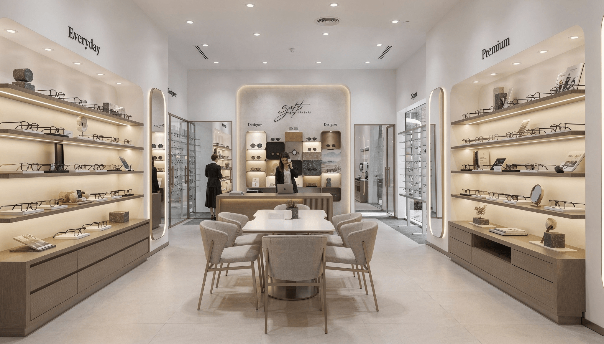
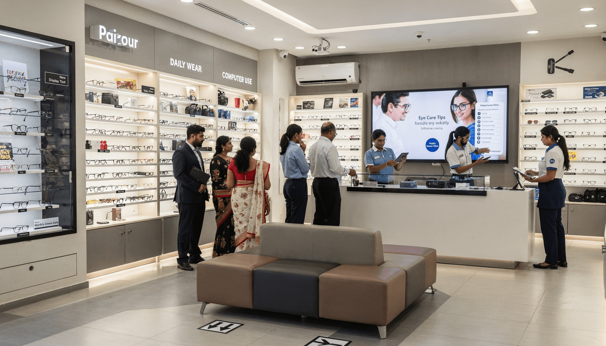
Visual merchandising: clarity over quantity
- Group by price, style, and use: so customers can compare quickly and confidently.
- Spotlight hero and premium SKUs: with focused lighting and minimal props to create aspiration.
- Seasonal rotation: refresh focal displays every 4–8 weeks to give repeat visitors something new without overhauling the whole store.
Big Chains Bigger Opportunities: Preparing to Welcome More Customers
Big Chains Bigger Opportunities: Preparing to Welcome More Customers
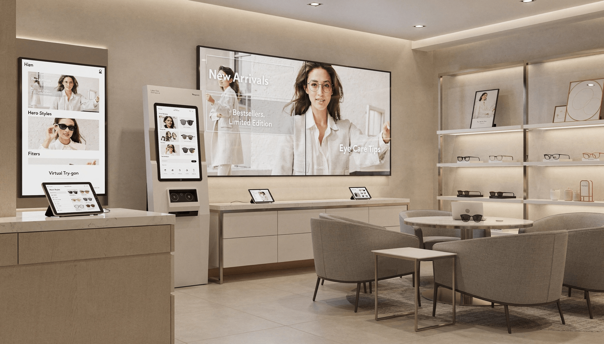
Waiting area: convert idle time into desire
- Comfortable seating: and a tidy layout make waiting pleasant and social.
- Digital browsing stations (tablet or kiosk): let customers explore hero SKUs, filters, and virtual try-ons while they wait.
- Looping visuals: on a screen new arrivals, bestsellers, and care tips—seed purchase ideas before consultation begins.
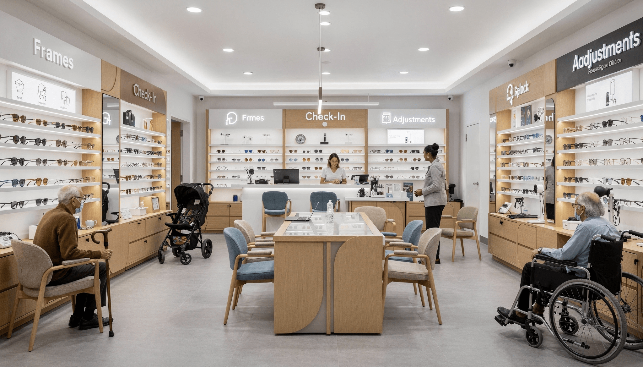
Accessibility and inclusive design
- Wide aisles and glare-free lighting: help seniors and families move and view products comfortably.
- Clear signage and ergonomic seating: reduce friction for first-time buyers and older customers.
- Easy-to-reach displays: and lower-height options ensure everyone can interact with frames independently.
Big Chains Bigger Opportunities: Preparing to Welcome More Customers

Big Chains Bigger Opportunities: Preparing to Welcome More Customers
Mirrors and micro-investments that pay
- Full-length mirrors: increase confidence and speed decision-making; place them near frame sections with seating nearby.
- Low-cost amenities: tea/coffee, phone charging, Wi‑Fi, magazines, and a kids’ corner—extend dwell time and lift average spend.
How to Create a Captivating Social Media Post
How to Create a Captivating Social Media Post
How to Create a Captivating Social Media Post
How to Create a Captivating Social Media Post
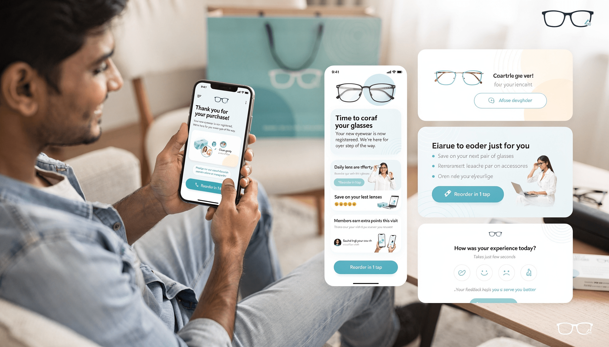
After-sales follow-up and loyalty
- Prompt thank-you messages and clear care instructions reduce returns and build trust.
- Reorder reminders and targeted loyalty offers turn one-time buyers into repeat customers.
- Short feedback requests provide actionable insights and show customers you care.
How to Create a Captivating Social Media Post
How to Create a Captivating Social Media Post
How to Create a Captivating Social Media Post
How to Create a Captivating Social Media Post
Big Chains Bigger Opportunities: Preparing to Welcome More Customers

Big Chains Bigger Opportunities: Preparing to Welcome More Customers
Quick measurement and improvement
- Track a few KPIs: conversion rate, average ticket size, repeat visits, staff knowledge, and customer feedback.
- Act on trends: if dwell time rises but conversion doesn’t, audit staff engagement and display clarity.
How to Create a Captivating Social Media Post
How to Create a Captivating Social Media Post
How to Create a Captivating Social Media Post
How to Create a Captivating Social Media Post
Risks, trade-offs, and practical tips
- Risk: Over-investing in fixtures that don’t match your catchment.
Fix: Pilot one window story for 4 weeks before full rollout. - Risk: Digital screens that are outdated or slow.
Fix: Schedule weekly content updates and test devices monthly. - Trade-off: More seating reduces display space.
Tip: Use modular seating that can be reconfigured during peak hours.
How to Create a Captivating Social Media Post
How to Create a Captivating Social Media Post
How to Create a Captivating Social Media Post
How to Create a Captivating Social Media Post
Big Chains Bigger Opportunities: Preparing to Welcome More Customers
Final note: make experience your moat
Prioritize clarity, trust signals (like your year of excellence), and small comforts. These targeted improvements are cost-effective, quick to implement, and create a distinct, human retail experience that helps you retain customers even when big chains move in.
Give color power to your exquisite designs
Give color power to your exquisite designs
What’s Next: Preparing to Welcome More Customers – Building a High‑Performance Team
With the store environment refined, the next step is people. In our next blog we’ll focus on Building a High‑Performance Team – Training, Incentives & Ownership, and on how staff, service, and the human touch turn visits into lasting relationships.
Stay tuned – it’s going to be all about preparation and growth!
Give color power to your exquisite designs
Give color power to your exquisite designs
Disclaimer:
This blog is created for general informational purposes only. The facts, figures, and insights shared are based on publicly available data and industry observations. They should not be considered financial, legal, or professional advice. Optical store owners are encouraged to use their own judgment and consult relevant experts before making business decisions.
Images used in this blog may have been generated with the help of artificial intelligence. These visuals are illustrative in nature and do not represent actual stores, products, or individuals. While every effort has been made to ensure accuracy and clarity, the author does not guarantee completeness or assume responsibility for outcomes based on this content.