Preparing to Welcome More Customers: Building a High-Performance Team
BLOG
Preparing to Welcome More Customers
Preparing to Welcome More Customers
Give color power to your exquisite designs
Part 03: The People Behind Every Great Customer Experience
Preparing to Welcome More Customers: Building a High-Performance Team
As awareness grows and more customers step into your optical store, one factor will decide whether they return or move on:
Give color power to your exquisite designs
Give color power to your exquisite designs
Your team.
Store design, product variety, and technology matter—but it’s your staff who shape the experiences customers remember. A motivated, well-trained team can turn a simple eyewear purchase into a lasting relationship.
The truth is clear: as footfall rises, owners cannot manage everything alone. Sustainable growth depends on building a high-performance team.

Building a High-Performance Team

Building a High-Performance Team
Why Your Team Is Your Greatest Advantage
Large chains may boast bigger budgets, wider inventories, and stronger advertising.
Independent optical stores have something equally powerful: personalized service.
Customers return because they trust the people serving them. They value familiar faces, honest advice, and genuine care.
A strong team helps you:
-
Elevate customer satisfaction
-
Boost sales conversions
-
Minimize complaints
-
Build loyalty and trust
-
Generate referrals and repeat business
The stronger your team, the stronger your reputation.
-
- 60-30-10 rule: This states 60% of the design should be covered with dominant color, 30% with secondary color or texture, and 10% with an accent.
Generally, the dominant and secondary colors should be neutral colors and you should use the accent color for highlighting and making things stand out in your design. Like we can have a red CTA (call to action) in a white, black design. - Tweaking your colors: Now as you have applied the rule to select the colors in your design, you can now make changes in the colors by using their variations.
Use and make them appealing, there is no rule as to what will appeal, you can use as many variations as you want as per the requirements. - Consistency with the colors: Now as you have made one design with the color pallet. Stick to this color pallet to use it in all your designs with variations only if needed. This will help you establish a brand presence.
- 60-30-10 rule: This states 60% of the design should be covered with dominant color, 30% with secondary color or texture, and 10% with an accent.
Give color power to your exquisite designs
Give color power to your exquisite designs

Give color power to your exquisite designs
Give color power to your exquisite designs
-
- 60-30-10 rule: This states 60% of the design should be covered with dominant color, 30% with secondary color or texture, and 10% with an accent.
Generally, the dominant and secondary colors should be neutral colors and you should use the accent color for highlighting and making things stand out in your design. Like we can have a red CTA (call to action) in a white, black design. - Tweaking your colors: Now as you have applied the rule to select the colors in your design, you can now make changes in the colors by using their variations.
Use and make them appealing, there is no rule as to what will appeal, you can use as many variations as you want as per the requirements. - Consistency with the colors: Now as you have made one design with the color pallet. Stick to this color pallet to use it in all your designs with variations only if needed. This will help you establish a brand presence.
- 60-30-10 rule: This states 60% of the design should be covered with dominant color, 30% with secondary color or texture, and 10% with an accent.
Give color power to your designs
Give color power to your designs
-
- 60-30-10 rule: This states 60% of the design should be covered with dominant color, 30% with secondary color or texture, and 10% with an accent.
Generally, the dominant and secondary colors should be neutral colors and you should use the accent color for highlighting and making things stand out in your design. Like we can have a red CTA (call to action) in a white, black design. - Tweaking your colors: Now as you have applied the rule to select the colors in your design, you can now make changes in the colors by using their variations.
Use and make them appealing, there is no rule as to what will appeal, you can use as many variations as you want as per the requirements. - Consistency with the colors: Now as you have made one design with the color pallet. Stick to this color pallet to use it in all your designs with variations only if needed. This will help you establish a brand presence.
- 60-30-10 rule: This states 60% of the design should be covered with dominant color, 30% with secondary color or texture, and 10% with an accent.
Give color power to your designs
How to select powerful colors for your designs
Give color power to your designs
How to select powerful colors for your designs
-
- 60-30-10 rule: This states 60% of the design should be covered with dominant color, 30% with secondary color or texture, and 10% with an accent.
Generally, the dominant and secondary colors should be neutral colors and you should use the accent color for highlighting and making things stand out in your design. Like we can have a red CTA (call to action) in a white, black design. - Tweaking your colors: Now as you have applied the rule to select the colors in your design, you can now make changes in the colors by using their variations.
Use and make them appealing, there is no rule as to what will appeal, you can use as many variations as you want as per the requirements. - Consistency with the colors: Now as you have made one design with the color pallet. Stick to this color pallet to use it in all your designs with variations only if needed. This will help you establish a brand presence.
- 60-30-10 rule: This states 60% of the design should be covered with dominant color, 30% with secondary color or texture, and 10% with an accent.
How to select powerful colors for your designs
Give color power to your designs
Give color power to your designs
How to select powerful colors for your designs
Give color power to your designs
How to select powerful colors for your designs
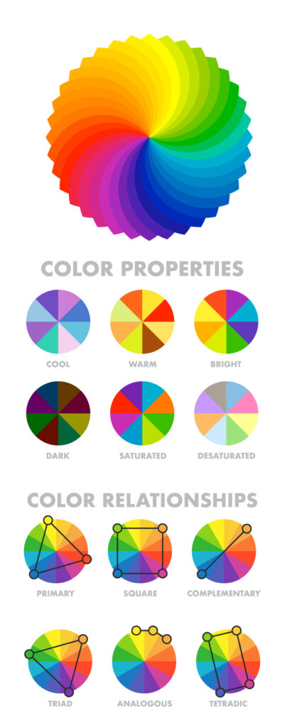
- Analogous Harmony:
When viewed together, these colors give a pleasing, serene appearance. These colors are present next to each other on the color wheel.
The most common example is violet, red-violet, and red. These 3 colors represent analogous harmonies. In lay mans language little bit of shade right and left on the color wheel. - Complementary Harmony:
Contrasting colors are often termed complementary harmonies. They are present on the opposite side of the color wheel. Red and green are the most common example of this kind of harmony. - Split-Complementary Harmony:
Using one base color and 2 complementary colors are generally termed as Split complementary colors. Here instead of one complementary color, two colors are picked symmetrically around it on the color wheel. e.g Orange, Blue-green, Blue-purple - Triadic Harmony:
Here we select three colors located at equal distances from each other on the color wheel. These selected colors are evenly spaced throughout the wheel. These color often creates a pleasing set of appearance when used together. e.g. Primary colors – red, blue, and yellow. - Monochromatic Harmony:
Selecting colors from a hue, and its various tints, tones, and shades associated. Shades are sometimes been derived by adding a tint of white, grey, and black to make a pallet.
- Analogous Harmony:
Give color power to your designs
How to select powerful colors for your designs
Give color power to your designs
How to select powerful colors for your designs
- Analogous Harmony:
When viewed together, these colors give a pleasing, serene appearance. These colors are present next to each other on the color wheel.
The most common example is violet, red-violet, and red. These 3 colors represent analogous harmonies. In lay mans language little bit of shade right and left on the color wheel. - Complementary Harmony:
Contrasting colors are often termed complementary harmonies. They are present on the opposite side of the color wheel. Red and green are the most common example of this kind of harmony. - Split-Complementary Harmony:
Using one base color and 2 complementary colors are generally termed as Split complementary colors. Here instead of one complementary color, two colors are picked symmetrically around it on the color wheel. e.g Orange, Blue-green, Blue-purple - Triadic Harmony:
Here we select three colors located at equal distances from each other on the color wheel. These selected colors are evenly spaced throughout the wheel. These color often creates a pleasing set of appearance when used together. e.g. Primary colors – red, blue, and yellow. - Monochromatic Harmony:
Selecting colors from a hue, and its various tints, tones, and shades associated. Shades are sometimes been derived by adding a tint of white, grey, and black to make a pallet.
- Analogous Harmony:
Give color power to your designs
How to select powerful colors for your designs
Hire for Attitude, Train for Skills
Technical knowledge can be taught.
But qualities like positivity, empathy, and communication are priceless. When hiring, look for people who:
-
Enjoy engaging with customers
-
Listen attentively
-
Show patience and empathy
-
Take ownership of tasks
-
Are eager to learn and adapt
The best employees aren’t always the most experienced—they’re the most adaptable.

Building a High-Performance Team

Building a High-Performance Team
Deliver Consistency Every Time
Every customer deserves the same level of service, no matter who assists them.
Set clear service standards, such as:
-
Greeting customers promptly
-
Understanding needs before suggesting products
-
Explaining lens options clearly
-
Maintaining professionalism in appearance and behavior
-
Following up after purchases when needed
Consistency builds trust and strengthens your brand.
Invest in Product Knowledge
Customers expect guidance when choosing frames and lenses. Your team should confidently explain:
-
Frame materials and durability
-
Lens types and benefits
-
Blue-light protection
-
Progressive and multifocal options
-
Children’s eyewear solutions
-
Care and maintenance tips
Knowledge builds confidence—and confident staff inspire confident customers.

Building a High-Performance Team

Building a High-Performance Team
Empower Problem Solvers
High-performing teams don’t just process transactions—they improve experiences. Encourage employees to:
-
Resolve issues quickly
-
Suggest practical solutions
-
Anticipate concerns
-
Take initiative
Empowered employees create memorable customer interactions.
How to Create a Captivating Social Media Post
How to Create a Captivating Social Media Post
How to Create a Captivating Social Media Post
How to Create a Captivating Social Media Post
Set Goals and Expectations
Clarity drives performance. Define measurable goals like:
-
Customer satisfaction scores
-
Follow-up completion rates
-
Appointment bookings
-
Repeat customer growth
-
Product knowledge milestones
Regular reviews keep teams focused and motivated.
How to Create a Captivating Social Media Post
How to Create a Captivating Social Media Post
How to Create a Captivating Social Media Post
How to Create a Captivating Social Media Post
Building a High-Performance Team

Building a High-Performance Team
Recognize and Reward Performance
Recognition doesn’t require big budgets. Small gestures make a big impact:
-
Public appreciation in meetings
-
Certificates of achievement
-
Small rewards for targets met
-
Learning opportunities
-
Positive feedback
Valued employees stay engaged and deliver exceptional service.
How to Create a Captivating Social Media Post
How to Create a Captivating Social Media Post
How to Create a Captivating Social Media Post
How to Create a Captivating Social Media Post
Build a Culture of Learning
The eyewear industry evolves constantly. Keep your team competitive with:
-
Weekly product updates
-
Vendor-led training
-
Role-play exercises
-
Customer service workshops
-
Team knowledge-sharing sessions
Continuous learning builds confidence and adaptability.
How to Create a Captivating Social Media Post
How to Create a Captivating Social Media Post
How to Create a Captivating Social Media Post
How to Create a Captivating Social Media Post

Building a High-Performance Team

Building a High-Performance Team
Communication Strengthens Teams
Most workplace issues stem from poor communication. Hold regular discussions to:
-
Share updates
-
Address feedback
-
Discuss challenges openly
-
Celebrate wins
-
Align priorities
Better communication means better teamwork.
How to Create a Captivating Social Media Post
How to Create a Captivating Social Media Post
How to Create a Captivating Social Media Post
How to Create a Captivating Social Media Post
Leadership Begins with You
Employees reflect their leaders. Store owners who show professionalism, respect, and commitment inspire teams to do the same.
A strong culture always starts at the top.
Prepare for Growth Before It Arrives
Ask yourself:
-
Do employees understand our service standards?
-
Are they confident discussing products?
-
Can the store run smoothly without constant supervision?
-
Do they feel motivated and supported?
-
Are we developing future leaders?
Your answers will determine how well your store scales.
How to Create a Captivating Social Media Post
How to Create a Captivating Social Media Post
How to Create a Captivating Social Media Post
How to Create a Captivating Social Media Post

Building a High-Performance Team
Final Thoughts
More customers mean more opportunities—if your team is ready.
A high-performance team is built through careful hiring, consistent training, clear communication, and genuine recognition.
In a competitive market, products can be copied and prices matched. But the quality of your people remains your most powerful advantage.
Invest in your team today, and they’ll drive your growth tomorrow.
Give color power to your exquisite designs
Give color power to your exquisite designs
What’s Next?
Part 04: Creating an Optical Store Experience Customers Remember We’ll explore how atmosphere, engagement, merchandising, and service touchpoints transform first-time visitors into loyal advocates.
Give color power to your exquisite designs
Give color power to your exquisite designs
Disclaimer:
This blog is created for general informational purposes only. The facts, figures, and insights shared are based on publicly available data and industry observations. They should not be considered financial, legal, or professional advice. Optical store owners are encouraged to use their own judgment and consult relevant experts before making business decisions.
Images used in this blog may have been generated with the help of artificial intelligence. These visuals are illustrative in nature and do not represent actual stores, products, or individuals. While every effort has been made to ensure accuracy and clarity, the author does not guarantee completeness or assume responsibility for outcomes based on this content.