Case Study: Building a Luxury Furniture Brand from the Ground Up
Case Study
Building a Luxury Furniture Brand from the Ground Up
From Strategy and Brand Identity to Pitch Deck and Website Launch
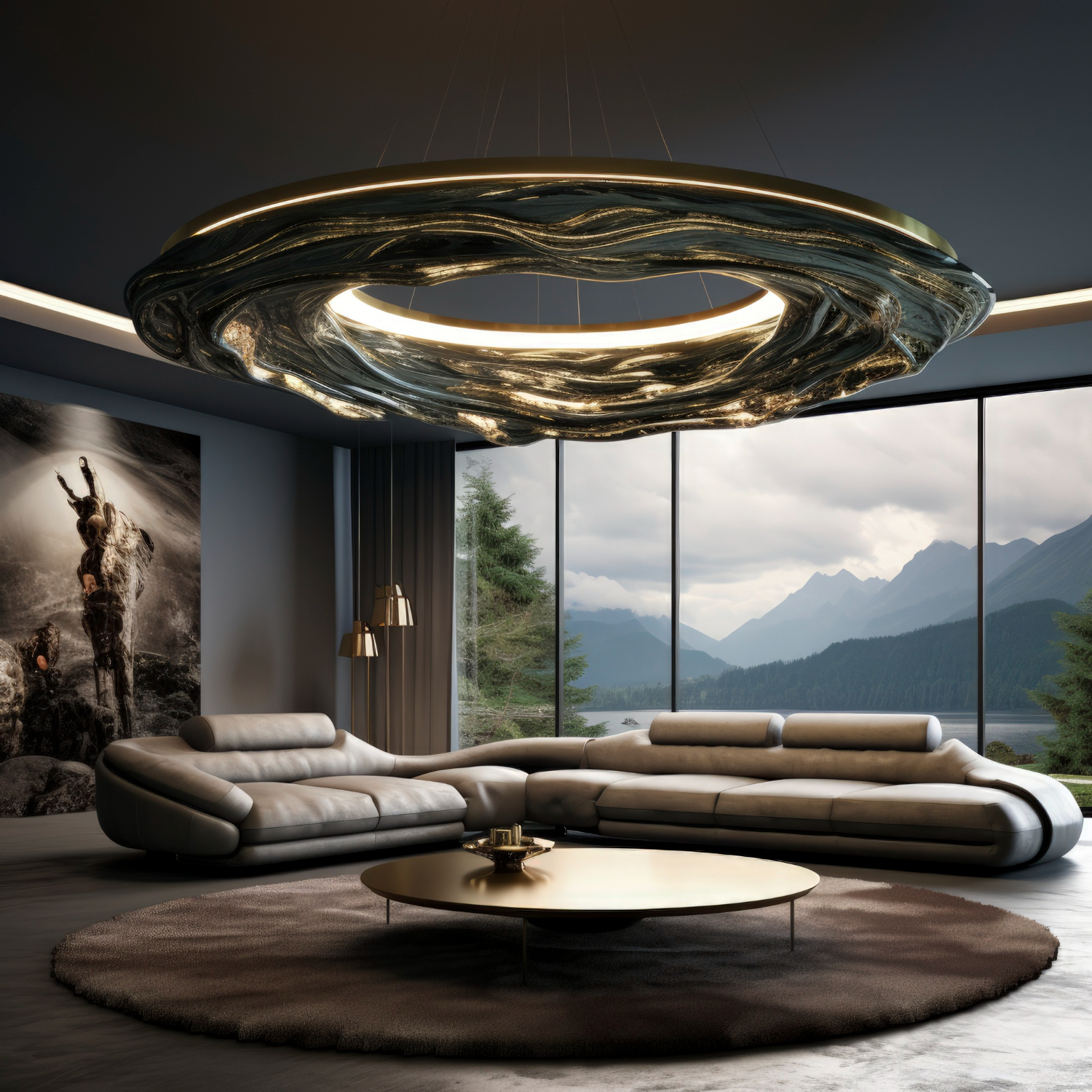
Building Arvè - From Concept Sketches to a Luxury Brand Launch in the UAE
Case Study: Building a Luxury Furniture Brand from the Ground Up
From Concept Sketches to a Luxury Brand Launch in the UAE
Give color power to your exquisite designs
Give color power to your exquisite designs
Strategy and Brand Identity to Pitch Deck and Website Launch
At 4C Media Co., we believe that great brands are not just designed—they are carefully built through strategy, storytelling, and execution.
Recently, we partnered with an emerging luxury furniture company based in the UAE to help transform an ambitious vision into a complete market-ready brand. The project involved creating every major touchpoint from scratch, including the brand identity, investor presentation, and digital presence.
This case study highlights how we developed a cohesive luxury brand experience from concept to launch.
Building a Luxury Furniture Brand from the Ground Up

Building a Luxury Furniture Brand from the Ground Up
The Challenge
The client was entering the premium furniture and interior lifestyle market with a unique philosophy centered around timeless design, curated living, and understated luxury.
While the vision was clear, the company required:
- A distinctive luxury brand identity
- A professional investor and business presentation
- A compelling brand narrative
- A premium digital presence
- Consistency across all customer-facing touchpoints
The objective was to create a brand that could confidently position itself within the highly competitive luxury market of the UAE.
-
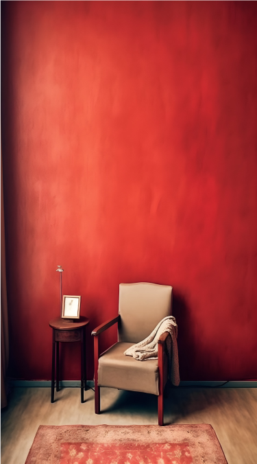
- 60-30-10 rule: This states 60% of the design should be covered with dominant color, 30% with secondary color or texture, and 10% with an accent.
Generally, the dominant and secondary colors should be neutral colors and you should use the accent color for highlighting and making things stand out in your design. Like we can have a red CTA (call to action) in a white, black design. - Tweaking your colors: Now as you have applied the rule to select the colors in your design, you can now make changes in the colors by using their variations.
Use and make them appealing, there is no rule as to what will appeal, you can use as many variations as you want as per the requirements. - Consistency with the colors: Now as you have made one design with the color pallet. Stick to this color pallet to use it in all your designs with variations only if needed. This will help you establish a brand presence.
- 60-30-10 rule: This states 60% of the design should be covered with dominant color, 30% with secondary color or texture, and 10% with an accent.
Give color power to your exquisite designs
Give color power to your exquisite designs
Give color power to your exquisite designs
Give color power to your exquisite designs
-
- 60-30-10 rule: This states 60% of the design should be covered with dominant color, 30% with secondary color or texture, and 10% with an accent.
Generally, the dominant and secondary colors should be neutral colors and you should use the accent color for highlighting and making things stand out in your design. Like we can have a red CTA (call to action) in a white, black design. - Tweaking your colors: Now as you have applied the rule to select the colors in your design, you can now make changes in the colors by using their variations.
Use and make them appealing, there is no rule as to what will appeal, you can use as many variations as you want as per the requirements. - Consistency with the colors: Now as you have made one design with the color pallet. Stick to this color pallet to use it in all your designs with variations only if needed. This will help you establish a brand presence.
- 60-30-10 rule: This states 60% of the design should be covered with dominant color, 30% with secondary color or texture, and 10% with an accent.
Give color power to your designs
Give color power to your designs
-
- 60-30-10 rule: This states 60% of the design should be covered with dominant color, 30% with secondary color or texture, and 10% with an accent.
Generally, the dominant and secondary colors should be neutral colors and you should use the accent color for highlighting and making things stand out in your design. Like we can have a red CTA (call to action) in a white, black design. - Tweaking your colors: Now as you have applied the rule to select the colors in your design, you can now make changes in the colors by using their variations.
Use and make them appealing, there is no rule as to what will appeal, you can use as many variations as you want as per the requirements. - Consistency with the colors: Now as you have made one design with the color pallet. Stick to this color pallet to use it in all your designs with variations only if needed. This will help you establish a brand presence.
- 60-30-10 rule: This states 60% of the design should be covered with dominant color, 30% with secondary color or texture, and 10% with an accent.
Give color power to your designs
How to select powerful colors for your designs
Give color power to your designs
How to select powerful colors for your designs
-
- 60-30-10 rule: This states 60% of the design should be covered with dominant color, 30% with secondary color or texture, and 10% with an accent.
Generally, the dominant and secondary colors should be neutral colors and you should use the accent color for highlighting and making things stand out in your design. Like we can have a red CTA (call to action) in a white, black design. - Tweaking your colors: Now as you have applied the rule to select the colors in your design, you can now make changes in the colors by using their variations.
Use and make them appealing, there is no rule as to what will appeal, you can use as many variations as you want as per the requirements. - Consistency with the colors: Now as you have made one design with the color pallet. Stick to this color pallet to use it in all your designs with variations only if needed. This will help you establish a brand presence.
- 60-30-10 rule: This states 60% of the design should be covered with dominant color, 30% with secondary color or texture, and 10% with an accent.
How to select powerful colors for your designs
Give color power to your designs
Give color power to your designs
How to select powerful colors for your designs
Give color power to your designs
How to select powerful colors for your designs
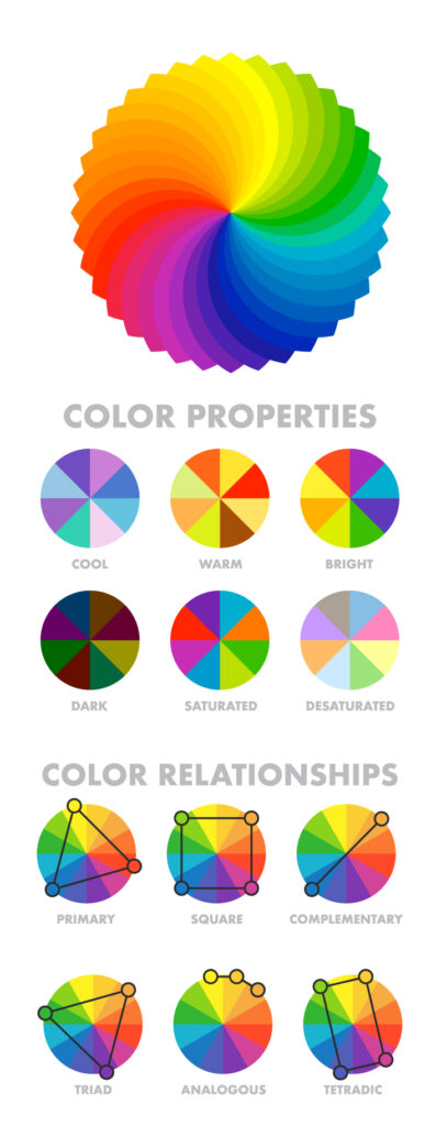
- Analogous Harmony:
When viewed together, these colors give a pleasing, serene appearance. These colors are present next to each other on the color wheel.
The most common example is violet, red-violet, and red. These 3 colors represent analogous harmonies. In lay mans language little bit of shade right and left on the color wheel. - Complementary Harmony:
Contrasting colors are often termed complementary harmonies. They are present on the opposite side of the color wheel. Red and green are the most common example of this kind of harmony. - Split-Complementary Harmony:
Using one base color and 2 complementary colors are generally termed as Split complementary colors. Here instead of one complementary color, two colors are picked symmetrically around it on the color wheel. e.g Orange, Blue-green, Blue-purple - Triadic Harmony:
Here we select three colors located at equal distances from each other on the color wheel. These selected colors are evenly spaced throughout the wheel. These color often creates a pleasing set of appearance when used together. e.g. Primary colors – red, blue, and yellow. - Monochromatic Harmony:
Selecting colors from a hue, and its various tints, tones, and shades associated. Shades are sometimes been derived by adding a tint of white, grey, and black to make a pallet.
- Analogous Harmony:
Give color power to your designs
How to select powerful colors for your designs
Give color power to your designs
How to select powerful colors for your designs
- Analogous Harmony:
When viewed together, these colors give a pleasing, serene appearance. These colors are present next to each other on the color wheel.
The most common example is violet, red-violet, and red. These 3 colors represent analogous harmonies. In lay mans language little bit of shade right and left on the color wheel. - Complementary Harmony:
Contrasting colors are often termed complementary harmonies. They are present on the opposite side of the color wheel. Red and green are the most common example of this kind of harmony. - Split-Complementary Harmony:
Using one base color and 2 complementary colors are generally termed as Split complementary colors. Here instead of one complementary color, two colors are picked symmetrically around it on the color wheel. e.g Orange, Blue-green, Blue-purple - Triadic Harmony:
Here we select three colors located at equal distances from each other on the color wheel. These selected colors are evenly spaced throughout the wheel. These color often creates a pleasing set of appearance when used together. e.g. Primary colors – red, blue, and yellow. - Monochromatic Harmony:
Selecting colors from a hue, and its various tints, tones, and shades associated. Shades are sometimes been derived by adding a tint of white, grey, and black to make a pallet.
- Analogous Harmony:
Give color power to your designs
How to select powerful colors for your designs
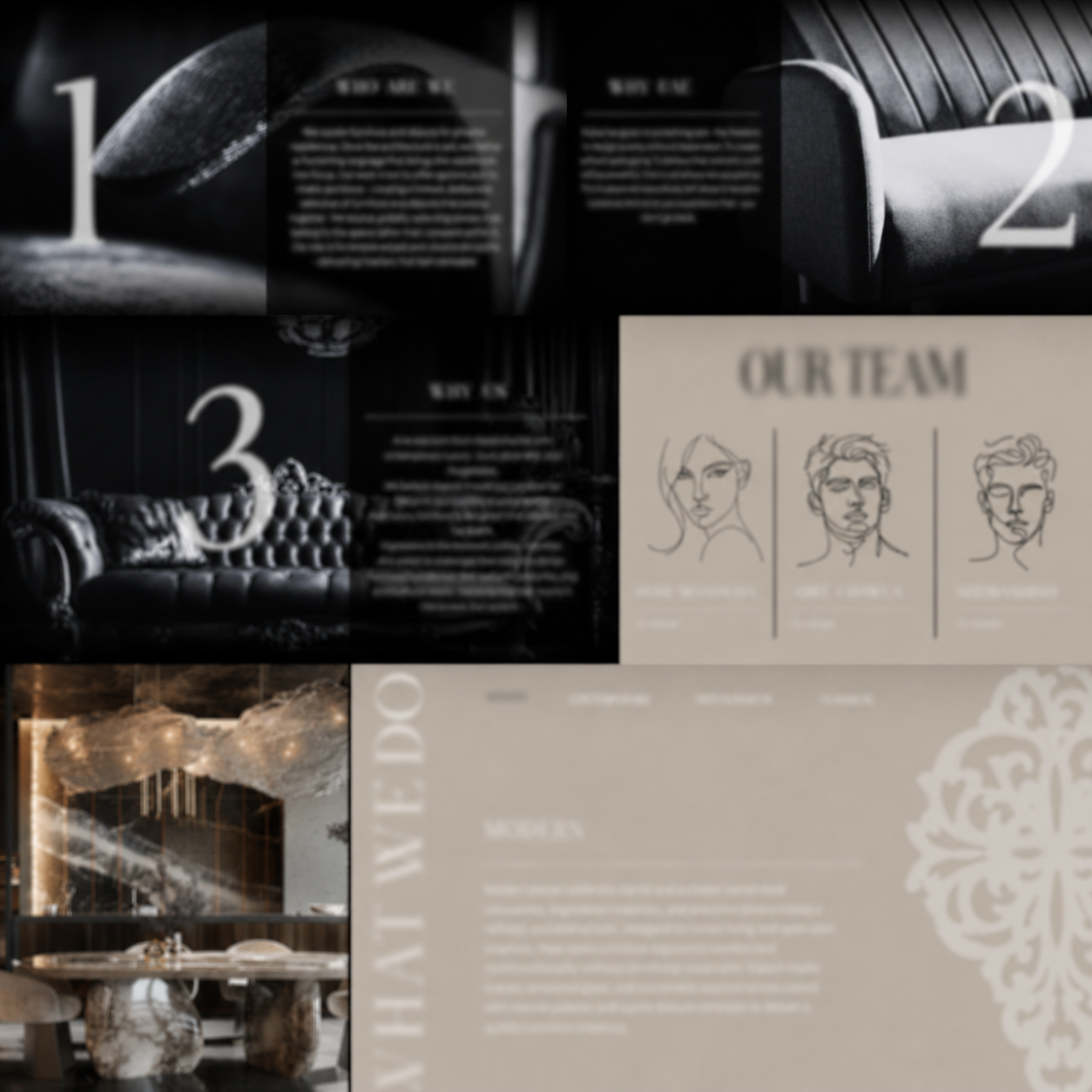
Our Solution
Brand Strategy & Positioning
Every successful brand begins with a strong foundation.
Our process started with extensive discovery sessions to understand the founders’ vision, target audience, market positioning, and long-term business goals.
We developed a strategic framework that defined:
- Brand personality
- Core messaging
- Market differentiation
- Customer perception
- Visual direction
This foundation became the blueprint for every creative decision that followed.

Building a Luxury Furniture Brand from the Ground Up
Building a Luxury Furniture Brand from the Ground Up
Logo Design & Visual Identity
Luxury brands demand a visual identity that communicates confidence, elegance, and longevity.
Our design team explored multiple concepts before refining a direction that balanced modern sophistication with timeless appeal.
The final identity system included:
- Primary and secondary logo variations
- Typography selection
- Color palette development
- Brand application guidelines
- Digital and print-ready assets
The result was a refined identity designed to scale across digital platforms, presentations, marketing materials, and future product branding.
Pitch Deck Design & Brand Storytelling
To support business development and stakeholder engagement, we created a high-end pitch deck that translated the company’s vision into a compelling story.
The presentation was designed to communicate:
- Brand philosophy
- Market opportunity
- Product positioning
- Customer journey
- Business model
- Future growth potential
Every slide was carefully structured to balance information with visual sophistication, creating an experience consistent with a luxury brand.
Building a Luxury Furniture Brand from the Ground Up
Building a Luxury Furniture Brand from the Ground Up
Website Design & Development
With the brand identity established, the next step was creating a digital experience worthy of the brand.
Our team handled the complete process, including:
- Website strategy
- User experience planning
- User interface design
- Content structure
- Responsive development
- Performance optimization
The website was designed to communicate the brand’s philosophy while providing an intuitive and premium browsing experience across desktop, tablet, and mobile devices.
How to Create a Captivating Social Media Post
How to Create a Captivating Social Media Post
How to Create a Captivating Social Media Post
How to Create a Captivating Social Media Post
Deliverables
4C Media Co. managed the project from concept to completion, delivering:
✔ Brand Discovery & Strategy
✔ Logo Design
✔ Visual Identity Development
✔ Brand Messaging & Storytelling
✔ Pitch Deck Design
✔ Website UX/UI Design
✔ Website Development
✔ Digital Brand Assets
How to Create a Captivating Social Media Post
How to Create a Captivating Social Media Post
How to Create a Captivating Social Media Post
How to Create a Captivating Social Media Post
Results
The project successfully transformed an early-stage concept into a fully developed luxury brand with a strong market presence.
By aligning branding, storytelling, presentation design, and digital experience under one strategic vision, we created a cohesive ecosystem that reflects the values of modern luxury and thoughtful design.
The result is a brand equipped with the tools, assets, and positioning needed to confidently enter a competitive market and establish credibility with customers, partners, and stakeholders.
How to Create a Captivating Social Media Post
How to Create a Captivating Social Media Post
How to Create a Captivating Social Media Post
How to Create a Captivating Social Media Post
Building a Luxury Furniture Brand from the Ground Up
Key Takeaway
The strongest brands are built through consistency.
When strategy, design, communication, and digital experiences work together, businesses create stronger connections with their audiences and leave a lasting impression.
This project is a testament to the value of an integrated approach to brand building—where every touchpoint is intentionally designed to tell the same story.
Give color power to your exquisite designs
Give color power to your exquisite designs
Confidentiality Notice
To respect client privacy and confidentiality agreements, specific brand names, business information, and proprietary assets have been omitted from this case study. The project is presented solely to demonstrate the strategic, creative, and technical capabilities delivered by 4C Media Co.