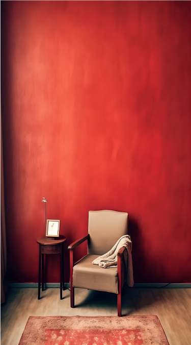
60-30-10 rule: This states 60% of the design should be covered with dominant color, 30% with secondary color or texture, and 10% with an accent.
Generally, the dominant and secondary colors should be neutral colors and you should use the accent color for highlighting and making things stand out in your design. Like we can have a red CTA (call to action) in a white, black design.
Tweaking your colors: Now as you have applied the rule to select the colors in your design, you can now make changes in the colors by using their variations.
Use and make them appealing, there is no rule as to what will appeal, you can use as many variations as you want as per the requirements.
Consistency with the colors: Now as you have made one design with the color pallet. Stick to this color pallet to use it in all your designs with variations only if needed. This will help you establish a brand presence.
Give color power to your designs
Give color power to your designs
60-30-10 rule: This states 60% of the design should be covered with dominant color, 30% with secondary color or texture, and 10% with an accent.
Generally, the dominant and secondary colors should be neutral colors and you should use the accent color for highlighting and making things stand out in your design. Like we can have a red CTA (call to action) in a white, black design.
Tweaking your colors: Now as you have applied the rule to select the colors in your design, you can now make changes in the colors by using their variations.
Use and make them appealing, there is no rule as to what will appeal, you can use as many variations as you want as per the requirements.
Consistency with the colors: Now as you have made one design with the color pallet. Stick to this color pallet to use it in all your designs with variations only if needed. This will help you establish a brand presence.
Give color power to your designs
How to select powerful colors for your designs
Give color power to your designs
How to select powerful colors for your designs
60-30-10 rule: This states 60% of the design should be covered with dominant color, 30% with secondary color or texture, and 10% with an accent.
Generally, the dominant and secondary colors should be neutral colors and you should use the accent color for highlighting and making things stand out in your design. Like we can have a red CTA (call to action) in a white, black design.
Tweaking your colors: Now as you have applied the rule to select the colors in your design, you can now make changes in the colors by using their variations.
Use and make them appealing, there is no rule as to what will appeal, you can use as many variations as you want as per the requirements.
Consistency with the colors: Now as you have made one design with the color pallet. Stick to this color pallet to use it in all your designs with variations only if needed. This will help you establish a brand presence.
How to select powerful colors for your designs
Give color power to your designs
Give color power to your designs
How to select powerful colors for your designs
Give color power to your designs
How to select powerful colors for your designs
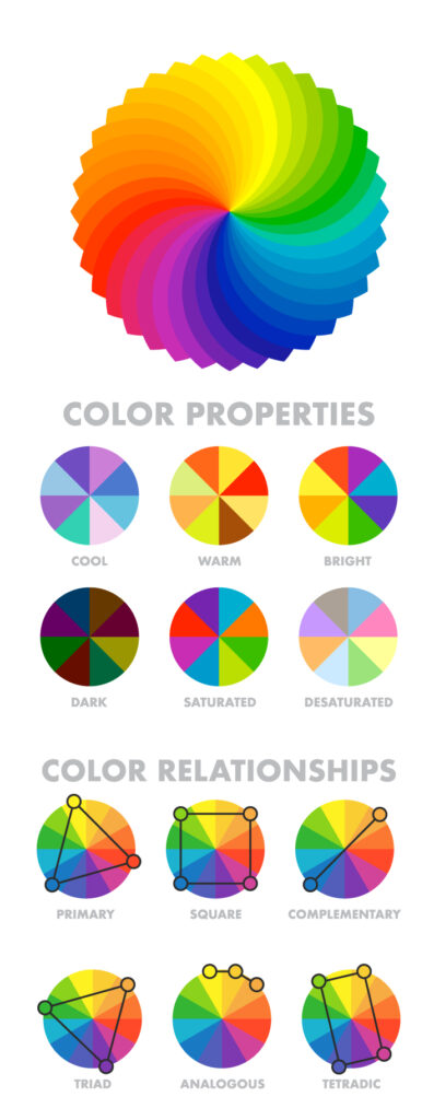
Analogous Harmony: When viewed together, these colors give a pleasing, serene appearance. These colors are present next to each other on the color wheel. The most common example is violet, red-violet, and red. These 3 colors represent analogous harmonies. In lay mans language little bit of shade right and left on the color wheel.
Complementary Harmony: Contrasting colors are often termed complementary harmonies. They are present on the opposite side of the color wheel. Red and green are the most common example of this kind of harmony.
Split-Complementary Harmony: Using one base color and 2 complementary colors are generally termed as Split complementary colors. Here instead of one complementary color, two colors are picked symmetrically around it on the color wheel. e.g Orange, Blue-green, Blue-purple
Triadic Harmony: Here we select three colors located at equal distances from each other on the color wheel. These selected colors are evenly spaced throughout the wheel. These color often creates a pleasing set of appearance when used together. e.g. Primary colors – red, blue, and yellow.
Monochromatic Harmony: Selecting colors from a hue, and its various tints, tones, and shades associated. Shades are sometimes been derived by adding a tint of white, grey, and black to make a pallet.
Give color power to your designs
How to select powerful colors for your designs
Give color power to your designs
How to select powerful colors for your designs
Analogous Harmony: When viewed together, these colors give a pleasing, serene appearance. These colors are present next to each other on the color wheel. The most common example is violet, red-violet, and red. These 3 colors represent analogous harmonies. In lay mans language little bit of shade right and left on the color wheel.
Complementary Harmony: Contrasting colors are often termed complementary harmonies. They are present on the opposite side of the color wheel. Red and green are the most common example of this kind of harmony.
Split-Complementary Harmony: Using one base color and 2 complementary colors are generally termed as Split complementary colors. Here instead of one complementary color, two colors are picked symmetrically around it on the color wheel. e.g Orange, Blue-green, Blue-purple
Triadic Harmony: Here we select three colors located at equal distances from each other on the color wheel. These selected colors are evenly spaced throughout the wheel. These color often creates a pleasing set of appearance when used together. e.g. Primary colors – red, blue, and yellow.
Monochromatic Harmony: Selecting colors from a hue, and its various tints, tones, and shades associated. Shades are sometimes been derived by adding a tint of white, grey, and black to make a pallet.
Give color power to your designs
How to select powerful colors for your designs
Give color power to your designs
How to select powerful colors for your designs
Analogous Harmony: When viewed together, these colors give a pleasing, serene appearance. These colors are present next to each other on the color wheel. The most common example is violet, red-violet, and red. These 3 colors represent analogous harmonies. In lay mans language little bit of shade right and left on the color wheel.
Complementary Harmony: Contrasting colors are often termed complementary harmonies. They are present on the opposite side of the color wheel. Red and green are the most common example of this kind of harmony.
Split-Complementary Harmony: Using one base color and 2 complementary colors are generally termed as Split complementary colors. Here instead of one complementary color, two colors are picked symmetrically around it on the color wheel. e.g Orange, Blue-green, Blue-purple
Triadic Harmony: Here we select three colors located at equal distances from each other on the color wheel. These selected colors are evenly spaced throughout the wheel. These color often creates a pleasing set of appearance when used together. e.g. Primary colors – red, blue, and yellow.
Monochromatic Harmony: Selecting colors from a hue, and its various tints, tones, and shades associated. Shades are sometimes been derived by adding a tint of white, grey, and black to make a pallet.
Give color power to your designs
How to select powerful colors for your designs
Give color power to your designs
How to select powerful colors for your designs
Analogous Harmony: When viewed together, these colors give a pleasing, serene appearance. These colors are present next to each other on the color wheel. The most common example is violet, red-violet, and red. These 3 colors represent analogous harmonies. In lay mans language little bit of shade right and left on the color wheel.
Complementary Harmony: Contrasting colors are often termed complementary harmonies. They are present on the opposite side of the color wheel. Red and green are the most common example of this kind of harmony.
Split-Complementary Harmony: Using one base color and 2 complementary colors are generally termed as Split complementary colors. Here instead of one complementary color, two colors are picked symmetrically around it on the color wheel. e.g Orange, Blue-green, Blue-purple
Triadic Harmony: Here we select three colors located at equal distances from each other on the color wheel. These selected colors are evenly spaced throughout the wheel. These color often creates a pleasing set of appearance when used together. e.g. Primary colors – red, blue, and yellow.
Monochromatic Harmony: Selecting colors from a hue, and its various tints, tones, and shades associated. Shades are sometimes been derived by adding a tint of white, grey, and black to make a pallet.
Give color power to your designs
How to select powerful colors for your designs
Give color power to your designs
How to select powerful colors for your designs
Analogous Harmony: When viewed together, these colors give a pleasing, serene appearance. These colors are present next to each other on the color wheel. The most common example is violet, red-violet, and red. These 3 colors represent analogous harmonies. In lay mans language little bit of shade right and left on the color wheel.
Complementary Harmony: Contrasting colors are often termed complementary harmonies. They are present on the opposite side of the color wheel. Red and green are the most common example of this kind of harmony.
Split-Complementary Harmony: Using one base color and 2 complementary colors are generally termed as Split complementary colors. Here instead of one complementary color, two colors are picked symmetrically around it on the color wheel. e.g Orange, Blue-green, Blue-purple
Triadic Harmony: Here we select three colors located at equal distances from each other on the color wheel. These selected colors are evenly spaced throughout the wheel. These color often creates a pleasing set of appearance when used together. e.g. Primary colors – red, blue, and yellow.
Monochromatic Harmony: Selecting colors from a hue, and its various tints, tones, and shades associated. Shades are sometimes been derived by adding a tint of white, grey, and black to make a pallet.
Give color power to your designs
How to select powerful colors for your designs
SELECTED WORK / E-COMMERCE / 2026
Couture meets custom-built commerce.
How we built a flexible, premium WordPress shopping experience for Ritika Goel Official—designed around intricate product choices, a better buying journey and practical business workflows.
Premium Indian fashion comes with complexity: sizes, colours, optional dupattas, different outfit combinations, product imagery and clear exchange information. The goal was a refined, easy-to-use store that respects all of those details without overwhelming the shopper.
THE CHALLENGE
Many choices, one product.
Complex variations and size configurations demanded more flexible shopping interfaces and thoughtful product presentation.
THE SOLUTION
Build around the brand.
WordPress and WooCommerce enhanced with business-specific PHP, JavaScript and CSS, paired with a clean editorial design.
PRODUCT DETAIL / UX FEATURE
02 / FEATURED DEVELOPMENT
Made for the way real women shop.
A standard size selector wasn’t enough. The storefront needed to accommodate tailored outfit decisions, including different measurements for upper and lower garments.
✓ Independent upper and lower size choices ✓ Extended sizing from XS to 6XL ✓ Colour and outfit configuration options ✓ Dynamic product information and variation logic
03 / WHAT WE BUILT
Thoughtful design. Serious functionality.
From product configuration to marketing readiness, each part of the website was approached as a connected customer and business experience.
◇
01 / PRODUCT ENGINEERING
Advanced garment variations
Custom product logic built around fashion-specific choices and detailed purchase configurations.
Meta Pixel events: PageView, ViewContent, AddToCart, InitiateCheckout
Product media preparation and optimisation
Colour variation galleries
Product imagery protection*
Collection and category navigation
Responsive mobile and tablet design
Custom PHP/WooCommerce development
Custom JavaScript interactions
Custom CSS design and refinement
05 / TECHNOLOGY
Built on familiar technology. Extended with custom code.
A practical architecture gives the brand control over its catalogue and room to grow, while supporting tailored commerce functionality where standard tools fall short.
WordPress
WooCommerce
Custom PHP
JavaScript
CSS
HTML
Email automation
Meta integration
06 / THE OUTCOME
A digital flagship that works around the business.
Ritika Goel Official now has a live customer-facing e-commerce platform with deeply customised garment selection, modern shopping tools and infrastructure for connected business and marketing workflows.
No unverified revenue, sales uplift or conversion improvement figures are used. Outcomes are qualitative rather than measured performance claims.
01
More flexibility for customers choosing complex outfits.
02
A clearer route from exploring a collection to purchasing.
03
Fashion-specific functionality built into WordPress and WooCommerce.
04
An extensible foundation for ongoing development and marketing.