Creating an Optical Store Experience Customers Remember
BLOG
Creating an Optical Store Experience Customers Remember
Preparing to Welcome More Customers
Give color power to your exquisite designs
Part 04: Turning First-Time Visitors into Loyal Advocates
Creating an Optical Store Experience Customers Remember
In our last blog, we discussed the importance of building a high-performance team. While a strong team is essential, there’s another factor that sets thriving optical stores apart:
Give color power to your exquisite designs
Give color power to your exquisite designs
The customer experience.
Today’s customers have endless choices—local stores, large chains, and even online platforms. What makes them choose one business over another is rarely just the product. It’s the experience they have while shopping.
This article explores how atmosphere, engagement, merchandising, and service touchpoints can transform first-time visitors into loyal advocates—customers who not only return but also recommend your store to family and friends.
A memorable experience builds trust, encourages repeat visits, and strengthens your reputation in the community.

Creating an Optical Store Experience Customers Remember

Creating an Optical Store Experience Customers Remember
From Store to Experience
Customers don’t just buy eyewear – they buy confidence, comfort, and professional guidance.
Two stores may sell the same frames, but the one that delivers a better experience will win loyalty and referrals.
A great experience makes customers feel:
-
Welcomed
-
Understood
-
Valued
-
Confident in their choices
-
Comfortable returning again
The goal isn’t just a sale – it’s a lasting impression.
-
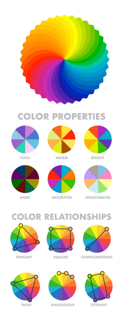
- 60-30-10 rule: This states 60% of the design should be covered with dominant color, 30% with secondary color or texture, and 10% with an accent.
Generally, the dominant and secondary colors should be neutral colors and you should use the accent color for highlighting and making things stand out in your design. Like we can have a red CTA (call to action) in a white, black design. - Tweaking your colors: Now as you have applied the rule to select the colors in your design, you can now make changes in the colors by using their variations.
Use and make them appealing, there is no rule as to what will appeal, you can use as many variations as you want as per the requirements. - Consistency with the colors: Now as you have made one design with the color pallet. Stick to this color pallet to use it in all your designs with variations only if needed. This will help you establish a brand presence.
- 60-30-10 rule: This states 60% of the design should be covered with dominant color, 30% with secondary color or texture, and 10% with an accent.
Give color power to your exquisite designs
Give color power to your exquisite designs

Give color power to your exquisite designs
Give color power to your exquisite designs
-
- 60-30-10 rule: This states 60% of the design should be covered with dominant color, 30% with secondary color or texture, and 10% with an accent.
Generally, the dominant and secondary colors should be neutral colors and you should use the accent color for highlighting and making things stand out in your design. Like we can have a red CTA (call to action) in a white, black design. - Tweaking your colors: Now as you have applied the rule to select the colors in your design, you can now make changes in the colors by using their variations.
Use and make them appealing, there is no rule as to what will appeal, you can use as many variations as you want as per the requirements. - Consistency with the colors: Now as you have made one design with the color pallet. Stick to this color pallet to use it in all your designs with variations only if needed. This will help you establish a brand presence.
- 60-30-10 rule: This states 60% of the design should be covered with dominant color, 30% with secondary color or texture, and 10% with an accent.
Give color power to your designs
Give color power to your designs
-
- 60-30-10 rule: This states 60% of the design should be covered with dominant color, 30% with secondary color or texture, and 10% with an accent.
Generally, the dominant and secondary colors should be neutral colors and you should use the accent color for highlighting and making things stand out in your design. Like we can have a red CTA (call to action) in a white, black design. - Tweaking your colors: Now as you have applied the rule to select the colors in your design, you can now make changes in the colors by using their variations.
Use and make them appealing, there is no rule as to what will appeal, you can use as many variations as you want as per the requirements. - Consistency with the colors: Now as you have made one design with the color pallet. Stick to this color pallet to use it in all your designs with variations only if needed. This will help you establish a brand presence.
- 60-30-10 rule: This states 60% of the design should be covered with dominant color, 30% with secondary color or texture, and 10% with an accent.
Give color power to your designs
How to select powerful colors for your designs
Give color power to your designs
How to select powerful colors for your designs
-
- 60-30-10 rule: This states 60% of the design should be covered with dominant color, 30% with secondary color or texture, and 10% with an accent.
Generally, the dominant and secondary colors should be neutral colors and you should use the accent color for highlighting and making things stand out in your design. Like we can have a red CTA (call to action) in a white, black design. - Tweaking your colors: Now as you have applied the rule to select the colors in your design, you can now make changes in the colors by using their variations.
Use and make them appealing, there is no rule as to what will appeal, you can use as many variations as you want as per the requirements. - Consistency with the colors: Now as you have made one design with the color pallet. Stick to this color pallet to use it in all your designs with variations only if needed. This will help you establish a brand presence.
- 60-30-10 rule: This states 60% of the design should be covered with dominant color, 30% with secondary color or texture, and 10% with an accent.
How to select powerful colors for your designs
Give color power to your designs
Give color power to your designs
How to select powerful colors for your designs
Give color power to your designs
How to select powerful colors for your designs
- Analogous Harmony:
When viewed together, these colors give a pleasing, serene appearance. These colors are present next to each other on the color wheel.
The most common example is violet, red-violet, and red. These 3 colors represent analogous harmonies. In lay mans language little bit of shade right and left on the color wheel. - Complementary Harmony:
Contrasting colors are often termed complementary harmonies. They are present on the opposite side of the color wheel. Red and green are the most common example of this kind of harmony. - Split-Complementary Harmony:
Using one base color and 2 complementary colors are generally termed as Split complementary colors. Here instead of one complementary color, two colors are picked symmetrically around it on the color wheel. e.g Orange, Blue-green, Blue-purple - Triadic Harmony:
Here we select three colors located at equal distances from each other on the color wheel. These selected colors are evenly spaced throughout the wheel. These color often creates a pleasing set of appearance when used together. e.g. Primary colors – red, blue, and yellow. - Monochromatic Harmony:
Selecting colors from a hue, and its various tints, tones, and shades associated. Shades are sometimes been derived by adding a tint of white, grey, and black to make a pallet.
- Analogous Harmony:
Give color power to your designs
How to select powerful colors for your designs
Give color power to your designs
How to select powerful colors for your designs
- Analogous Harmony:
When viewed together, these colors give a pleasing, serene appearance. These colors are present next to each other on the color wheel.
The most common example is violet, red-violet, and red. These 3 colors represent analogous harmonies. In lay mans language little bit of shade right and left on the color wheel. - Complementary Harmony:
Contrasting colors are often termed complementary harmonies. They are present on the opposite side of the color wheel. Red and green are the most common example of this kind of harmony. - Split-Complementary Harmony:
Using one base color and 2 complementary colors are generally termed as Split complementary colors. Here instead of one complementary color, two colors are picked symmetrically around it on the color wheel. e.g Orange, Blue-green, Blue-purple - Triadic Harmony:
Here we select three colors located at equal distances from each other on the color wheel. These selected colors are evenly spaced throughout the wheel. These color often creates a pleasing set of appearance when used together. e.g. Primary colors – red, blue, and yellow. - Monochromatic Harmony:
Selecting colors from a hue, and its various tints, tones, and shades associated. Shades are sometimes been derived by adding a tint of white, grey, and black to make a pallet.
- Analogous Harmony:
Give color power to your designs
How to select powerful colors for your designs
Atmosphere Sets the Tone
The experience begins before a single word is spoken.
Your store’s atmosphere shapes how customers feel the moment they walk in. Focus on:
-
Clean, organized displays
-
Bright, comfortable lighting
-
Easy-to-navigate sections
-
Professional signage
-
Comfortable seating
-
A welcoming reception desk
An inviting environment encourages browsing, builds trust, and sets the stage for positive interactions.

Creating an Optical Store Experience Customers Remember

Creating an Optical Store Experience Customers Remember
Engagement Builds Connection
Most customers seek guidance, not just products. Engagement starts with listening.
Train your team to:
-
Ask thoughtful questions
-
Understand lifestyle needs
-
Learn about work and daily routines
-
Discuss comfort preferences
-
Explain options clearly
Meaningful conversations create trust and deepen relationships.
Merchandising That Simplifies Choices
Merchandising isn’t about showing more—it’s about helping customers decide.
Too many options overwhelm. Organize displays into clear categories:
-
Professional Collection
-
Everyday Essentials
-
Lightweight Comfort
-
Premium Designer Styles
-
Children’s Eyewear
-
Budget-Friendly Options
Smart merchandising highlights popular products and promotions without clutter.

Creating an Optical Store Experience Customers Remember

Creating an Optical Store Experience Customers Remember
Define Service Touchpoints
Every interaction is a touchpoint that shapes perception. Key ones include:
-
First Greeting – A warm welcome sets the tone.
-
Eye Examination – Professional, organized, confidence-building.
-
Recommendations – Honest guidance, not pushy selling.
-
Purchase Process – Smooth billing and ordering.
-
Delivery & Collection – Clear timelines and communication.
-
After-Sales Support – Follow-ups that show ongoing care.
Each touchpoint reinforces your brand values.
How to Create a Captivating Social Media Post
How to Create a Captivating Social Media Post
How to Create a Captivating Social Media Post
How to Create a Captivating Social Media Post
Make Frame Selection Enjoyable
Choosing eyewear can feel overwhelming. Your team can ease the process by:
-
Narrowing options based on needs
-
Offering style suggestions
-
Explaining materials and durability
-
Comparing alternatives clearly
Supportive guidance makes the buying process enjoyable.
How to Create a Captivating Social Media Post
How to Create a Captivating Social Media Post
How to Create a Captivating Social Media Post
How to Create a Captivating Social Media Post

Creating an Optical Store Experience Customers Remember

Creating an Optical Store Experience Customers Remember
Educate, Don’t Just Sell
Modern customers value informed recommendations. Educate them about:
-
Lens technologies
-
Blue-light protection
-
Progressive lenses
-
Anti-reflective coatings
-
UV protection
-
Frame care
Education builds confidence and positions your store as a trusted advisor.
How to Create a Captivating Social Media Post
How to Create a Captivating Social Media Post
How to Create a Captivating Social Media Post
How to Create a Captivating Social Media Post
Reduce Friction
Even small inconveniences can spoil the experience. Simplify the journey by:
-
Minimizing wait times
-
Communicating processes clearly
-
Displaying transparent pricing
-
Keeping records organized
-
Offering easy appointment scheduling
The smoother the process, the more likely customers will return.
How to Create a Captivating Social Media Post
How to Create a Captivating Social Media Post
How to Create a Captivating Social Media Post
How to Create a Captivating Social Media Post

Creating an Optical Store Experience Customers Remember

Creating an Optical Store Experience Customers Remember
The Power of Small Gestures
Often, it’s the little things customers remember:
-
Complimentary cleaning
-
Free adjustments
-
Personalized thank-you notes
-
Birthday wishes
-
Eye check-up reminders
-
Quick follow-up calls
Small gestures create emotional connections and long-term loyalty.
How to Create a Captivating Social Media Post
How to Create a Captivating Social Media Post
How to Create a Captivating Social Media Post
How to Create a Captivating Social Media Post
After-Sales Service Matters
The journey doesn’t end at payment. Strong after-sales support includes:
-
Checking satisfaction
-
Assisting with adjustments
-
Handling warranties smoothly
-
Offering care guidance
-
Sending service reminders
After-sales care is often the reason customers choose you again.
How to Create a Captivating Social Media Post
How to Create a Captivating Social Media Post
How to Create a Captivating Social Media Post
How to Create a Captivating Social Media Post

Creating an Optical Store Experience Customers Remember

Creating an Optical Store Experience Customers Remember
From Customers to Advocates
The ultimate goal isn’t just retention—it’s advocacy. Loyal advocates:
-
Recommend your store
-
Leave positive reviews
-
Return for future purchases
-
Bring family and friends
-
Strengthen your reputation
Every positive interaction moves you closer to this outcome.
How to Create a Captivating Social Media Post
How to Create a Captivating Social Media Post
How to Create a Captivating Social Media Post
How to Create a Captivating Social Media Post
Preparing for Growth
As awareness and footfall rise, customer experience becomes your biggest advantage. Ask yourself:
-
Does my store create a strong first impression?
-
Are we engaging customers meaningfully?
-
Is merchandising helping decisions?
-
Are service touchpoints consistent?
-
Would customers recommend us enthusiastically?
Your answers reveal your growth opportunities.
How to Create a Captivating Social Media Post
How to Create a Captivating Social Media Post
How to Create a Captivating Social Media Post
How to Create a Captivating Social Media Post

Creating an Optical Store Experience Customers Remember
Final Thoughts
Products can be copied. Prices can be matched. Promotions can be replicated.
But customer experience is unique—and hard to duplicate.
By focusing on atmosphere, engagement, merchandising, and service touchpoints, independent optical stores can create experiences customers remember long after they leave.
The businesses that thrive won’t just sell eyewear. They’ll deliver experiences worth talking about.
Give color power to your exquisite designs
Give color power to your exquisite designs
What’s Next?
Part 05: Creating Customer Loyalty Beyond the First Purchase We’ll explore how successful optical stores build long-term relationships through retention strategies, loyalty programs, personalized service, and ongoing engagement.
Because attracting customers is only the beginning. Sustainable growth comes from turning satisfied customers into loyal advocates.
Give color power to your exquisite designs
Give color power to your exquisite designs
Disclaimer:
This blog is created for general informational purposes only. The facts, figures, and insights shared are based on publicly available data and industry observations. They should not be considered financial, legal, or professional advice. Optical store owners are encouraged to use their own judgment and consult relevant experts before making business decisions.
Images used in this blog may have been generated with the help of artificial intelligence. These visuals are illustrative in nature and do not represent actual stores, products, or individuals. While every effort has been made to ensure accuracy and clarity, the author does not guarantee completeness or assume responsibility for outcomes based on this content.