fbpx

4C Media Co

logo-white

Give color power to your exquisite designs

BLOG

Give color power to your exquisite designs

Part 01 - Color Palette

Give color power to your exquisite designs

Part 01 - Color Palette

Give color power to your exquisite designs

Using colors helps enhance the design’s many folds. Thus selecting colors for your design is an important part of the brand-building process. All your communication needs to be informative, but before that, they need to be attractive enough to catch the eye of the customers.

Here we will explain you few tips and tricks to select and use the colors for your design in order to enhance the visual quality and make your advertisement/ social media post/ print collaterals etc attractive.

Find below the tips and tricks to create and use color palette:

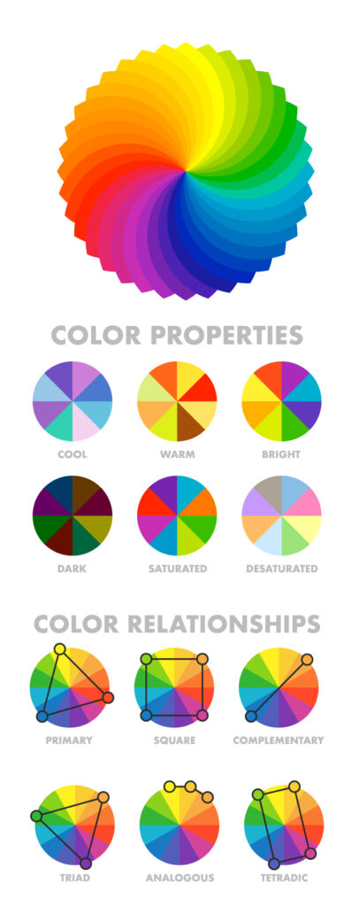
1. Creating a color palette: Although, it is the most challenging part. But it will help you make things easier in the process of creating the design. In case you already have one (for the brand you are designing for), that would be an add-on advantage. The easiest way to make a color palette is to use color harmonies.

Find below a few of them for your reference: 

Give color power to your exquisite designs

Give color power to your exquisite designs

Give color power to your exquisite designs

Give color power to your exquisite designs

Give color power to your exquisite designs

    • Analogous Harmony:
      When viewed together, these colors give a pleasing, serene appearance. These colors are present next to each other on the color wheel.
      The most common example is violet, red-violet, and red. These 3 colors represent analogous harmonies. In lay mans language little bit of shade right and left on the color wheel.

    • Complementary Harmony:
      Contrasting colors are often termed complementary harmonies. They are present on the opposite side of the color wheel. Red and green are the most common example of this kind of harmony.

    • Split-Complementary Harmony: 
      Using one base color and 2 complementary colors are generally termed as  Split complementary colors. Here instead of one complementary color, two colors are picked symmetrically around it on the color wheel. e.g Orange, Blue-green, Blue-purple

    • Triadic Harmony:
      Here we select three colors located at equal distances from each other on the color wheel. These selected colors are evenly spaced throughout the wheel. These color often creates a pleasing set of appearance when used together. e.g. Primary colors – red, blue, and yellow.

    • Monochromatic Harmony: 
      Selecting colors from a hue, and its various tints, tones, and shades associated. Shades are sometimes been derived by adding a tint of white, grey, and black to make a palette. 

Give color power to your exquisite designs

Give color power to your exquisite designs

2. Using the Color Palette:  Once you are ready with the color palette, it is now time to apply your color palette to the design. Here are some rules to follow before engaging yourself in coloring.  

Give color power to your exquisite designs

Give color power to your exquisite designs

    • 60-30-10 rule: This states 60% of the design should be covered with dominant color, 30% with secondary color or texture, and 10% with an accent.

      Generally, the dominant and secondary colors should be neutral colors and you should use the accent color for highlighting and making things stand out in your design. Like we can have a red CTA (call to action) in a white, black design.


    • Tweaking your colors: Now as you have applied the rule to select the colors in your design, you can now make changes in the colors by using their variations.

      Use and make them appealing, there is no rule as to what will appeal, you can use as many variations as you want as per the requirements.


    • Consistency with the colors: Now as you have made one design with the color palette. Stick to this color palette to use it in all your designs with variations only if needed. This will help you establish a brand presence.

Give color power to your exquisite designs

Give color power to your exquisite designs

Give color power to your exquisite designs

Give color power to your exquisite designs

3. Test your Design with the Color Palette:  After creating the design with your color palette. Now you can test your design with a small group of people for their reviews or you can use A/B testing on meta etc.

Sometimes you get to love so much of the work you have put hard work into, that you forget a few minor yet important details. It is always advisable to use a design on a smaller group before using it for mass. 

4. Conclusion: Making a color palette is not an easy task.  It takes a lot of labor and skills for iteration and careful application to reap benefits from the designs.

The right color palette when selected can help you make designs appeal, create brand image, & brand perception, enhance brand value, impact the target customer, draws more customers and sales, and increase the level of interaction in this digitally disruptive world. 

Give color power to your exquisite designs

Give color power to your exquisite designs

    • 60-30-10 rule: This states 60% of the design should be covered with dominant color, 30% with secondary color or texture, and 10% with an accent.

      Generally, the dominant and secondary colors should be neutral colors and you should use the accent color for highlighting and making things stand out in your design. Like we can have a red CTA (call to action) in a white, black design.

    • Tweaking your colors: Now as you have applied the rule to select the colors in your design, you can now make changes in the colors by using their variations.

      Use and make them appealing, there is no rule as to what will appeal, you can use as many variations as you want as per the requirements.

    • Consistency with the colors: Now as you have made one design with the color pallet. Stick to this color pallet to use it in all your designs with variations only if needed. This will help you establish a brand presence.

Give color power to your exquisite designs

Give color power to your exquisite designs

Give color power to your exquisite designs

Give color power to your exquisite designs

Give color power to your exquisite designs

Give color power to your designs

    • 60-30-10 rule: This states 60% of the design should be covered with dominant color, 30% with secondary color or texture, and 10% with an accent.

      Generally, the dominant and secondary colors should be neutral colors and you should use the accent color for highlighting and making things stand out in your design. Like we can have a red CTA (call to action) in a white, black design.

    • Tweaking your colors: Now as you have applied the rule to select the colors in your design, you can now make changes in the colors by using their variations.

      Use and make them appealing, there is no rule as to what will appeal, you can use as many variations as you want as per the requirements.

    • Consistency with the colors: Now as you have made one design with the color pallet. Stick to this color pallet to use it in all your designs with variations only if needed. This will help you establish a brand presence.

Give color power to your designs

Give color power to your designs

    • 60-30-10 rule: This states 60% of the design should be covered with dominant color, 30% with secondary color or texture, and 10% with an accent.

      Generally, the dominant and secondary colors should be neutral colors and you should use the accent color for highlighting and making things stand out in your design. Like we can have a red CTA (call to action) in a white, black design.

    • Tweaking your colors: Now as you have applied the rule to select the colors in your design, you can now make changes in the colors by using their variations.

      Use and make them appealing, there is no rule as to what will appeal, you can use as many variations as you want as per the requirements.

    • Consistency with the colors: Now as you have made one design with the color pallet. Stick to this color pallet to use it in all your designs with variations only if needed. This will help you establish a brand presence.

Give color power to your designs

How to select powerful colors for your designs

Give color power to your designs

How to select powerful colors for your designs

    • 60-30-10 rule: This states 60% of the design should be covered with dominant color, 30% with secondary color or texture, and 10% with an accent.

      Generally, the dominant and secondary colors should be neutral colors and you should use the accent color for highlighting and making things stand out in your design. Like we can have a red CTA (call to action) in a white, black design.

    • Tweaking your colors: Now as you have applied the rule to select the colors in your design, you can now make changes in the colors by using their variations.

      Use and make them appealing, there is no rule as to what will appeal, you can use as many variations as you want as per the requirements.

    • Consistency with the colors: Now as you have made one design with the color pallet. Stick to this color pallet to use it in all your designs with variations only if needed. This will help you establish a brand presence.

How to select powerful colors for your designs

Give color power to your designs

Give color power to your designs

How to select powerful colors for your designs

Give color power to your exquisite designs

Give color power to your designs

How to select powerful colors for your designs

    • Analogous Harmony:
      When viewed together, these colors give a pleasing, serene appearance. These colors are present next to each other on the color wheel.
      The most common example is violet, red-violet, and red. These 3 colors represent analogous harmonies. In lay mans language little bit of shade right and left on the color wheel.

    • Complementary Harmony:
      Contrasting colors are often termed complementary harmonies. They are present on the opposite side of the color wheel. Red and green are the most common example of this kind of harmony.

    • Split-Complementary Harmony: 
      Using one base color and 2 complementary colors are generally termed as  Split complementary colors. Here instead of one complementary color, two colors are picked symmetrically around it on the color wheel. e.g Orange, Blue-green, Blue-purple

    • Triadic Harmony:
      Here we select three colors located at equal distances from each other on the color wheel. These selected colors are evenly spaced throughout the wheel. These color often creates a pleasing set of appearance when used together. e.g. Primary colors – red, blue, and yellow.

    • Monochromatic Harmony: 
      Selecting colors from a hue, and its various tints, tones, and shades associated. Shades are sometimes been derived by adding a tint of white, grey, and black to make a pallet. 

Give color power to your designs

How to select powerful colors for your designs

Keep updated with more information

Subscribe for our newsletter