fbpx

4C Media Co

logo-white

How to Create a Captivating Social Media Post

BLOG

How to Create a Captivating Social Media Post

Part 01 - Social Media Posts

Give color power to your exquisite designs

Part 01 - Social Media Posts

How to Create a Captivating Social Media Post

In the fast-paced world of social media, grabbing your audience’s attention within seconds is crucial. Whether you’re promoting a new product, sharing a company update, or engaging with your community, crafting the perfect post is an art. Here’s a step-by-step guide to help you create a social media post that not only catches the eye but also encourages interaction.

Give color power to your exquisite designs

Give color power to your exquisite designs

1. Know Your Audience

Understanding who you are talking to is the first step in creating content that resonates. Consider the following:

  • Demographics: Age, gender, location, etc.
  • Interests: What are their hobbies, interests, and values?
  • Behavior: When are they most active online? What kind of content do they engage with?

How to Create a Captivating Social Media Post

How to Create a Captivating Social Media Pos

2. Define Your Goal

What do you want to achieve with this post? Common goals include:

  • Increasing brand awareness
  • Driving traffic to your website
  • Generating leads or sales
  • Encouraging engagement (likes, comments, shares)

How to Create a Captivating Social Media Post

    • 60-30-10 rule: This states 60% of the design should be covered with dominant color, 30% with secondary color or texture, and 10% with an accent.

      Generally, the dominant and secondary colors should be neutral colors and you should use the accent color for highlighting and making things stand out in your design. Like we can have a red CTA (call to action) in a white, black design.

    • Tweaking your colors: Now as you have applied the rule to select the colors in your design, you can now make changes in the colors by using their variations.

      Use and make them appealing, there is no rule as to what will appeal, you can use as many variations as you want as per the requirements.

    • Consistency with the colors: Now as you have made one design with the color pallet. Stick to this color pallet to use it in all your designs with variations only if needed. This will help you establish a brand presence.

Give color power to your exquisite designs

Give color power to your exquisite designs

Give color power to your exquisite designs

Give color power to your exquisite designs

    • 60-30-10 rule: This states 60% of the design should be covered with dominant color, 30% with secondary color or texture, and 10% with an accent.

      Generally, the dominant and secondary colors should be neutral colors and you should use the accent color for highlighting and making things stand out in your design. Like we can have a red CTA (call to action) in a white, black design.

    • Tweaking your colors: Now as you have applied the rule to select the colors in your design, you can now make changes in the colors by using their variations.

      Use and make them appealing, there is no rule as to what will appeal, you can use as many variations as you want as per the requirements.

    • Consistency with the colors: Now as you have made one design with the color pallet. Stick to this color pallet to use it in all your designs with variations only if needed. This will help you establish a brand presence.

Give color power to your designs

Give color power to your designs

    • 60-30-10 rule: This states 60% of the design should be covered with dominant color, 30% with secondary color or texture, and 10% with an accent.

      Generally, the dominant and secondary colors should be neutral colors and you should use the accent color for highlighting and making things stand out in your design. Like we can have a red CTA (call to action) in a white, black design.

    • Tweaking your colors: Now as you have applied the rule to select the colors in your design, you can now make changes in the colors by using their variations.

      Use and make them appealing, there is no rule as to what will appeal, you can use as many variations as you want as per the requirements.

    • Consistency with the colors: Now as you have made one design with the color pallet. Stick to this color pallet to use it in all your designs with variations only if needed. This will help you establish a brand presence.

Give color power to your designs

How to select powerful colors for your designs

Give color power to your designs

How to select powerful colors for your designs

    • 60-30-10 rule: This states 60% of the design should be covered with dominant color, 30% with secondary color or texture, and 10% with an accent.

      Generally, the dominant and secondary colors should be neutral colors and you should use the accent color for highlighting and making things stand out in your design. Like we can have a red CTA (call to action) in a white, black design.

    • Tweaking your colors: Now as you have applied the rule to select the colors in your design, you can now make changes in the colors by using their variations.

      Use and make them appealing, there is no rule as to what will appeal, you can use as many variations as you want as per the requirements.

    • Consistency with the colors: Now as you have made one design with the color pallet. Stick to this color pallet to use it in all your designs with variations only if needed. This will help you establish a brand presence.

How to select powerful colors for your designs

Give color power to your designs

Give color power to your designs

How to select powerful colors for your designs

Give color power to your exquisite designs

Give color power to your designs

How to select powerful colors for your designs

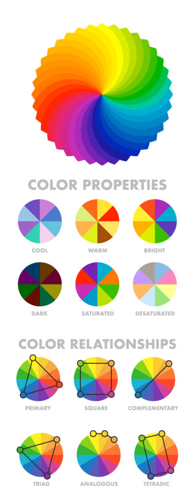
    • Analogous Harmony:
      When viewed together, these colors give a pleasing, serene appearance. These colors are present next to each other on the color wheel.
      The most common example is violet, red-violet, and red. These 3 colors represent analogous harmonies. In lay mans language little bit of shade right and left on the color wheel.

    • Complementary Harmony:
      Contrasting colors are often termed complementary harmonies. They are present on the opposite side of the color wheel. Red and green are the most common example of this kind of harmony.

    • Split-Complementary Harmony: 
      Using one base color and 2 complementary colors are generally termed as  Split complementary colors. Here instead of one complementary color, two colors are picked symmetrically around it on the color wheel. e.g Orange, Blue-green, Blue-purple

    • Triadic Harmony:
      Here we select three colors located at equal distances from each other on the color wheel. These selected colors are evenly spaced throughout the wheel. These color often creates a pleasing set of appearance when used together. e.g. Primary colors – red, blue, and yellow.

    • Monochromatic Harmony: 
      Selecting colors from a hue, and its various tints, tones, and shades associated. Shades are sometimes been derived by adding a tint of white, grey, and black to make a pallet. 

Give color power to your designs

How to select powerful colors for your designs

3. Craft Engaging Copy

Your text should be concise, clear, and compelling. Here are some tips:

  • Hook them early: Start with a question, a bold statement, or an interesting fact.
  • Be authentic: Speak in a voice that reflects your brand’s personality.
  • Include a call-to-action (CTA): Encourage your audience to do something, whether it’s visiting your website, sharing the post, or leaving a comment.

How to Create a Captivating Social Media Post

4. Use Eye-Catching Visuals

A strong visual can make your post stand out. Consider:

  • High-quality images or videos: Ensure your visuals are clear and relevant.
  • Brand consistency: Use your brand’s colors, fonts, and style.
  • Graphics and text overlays: Highlight key messages with text overlays or graphics.

How to Create a Captivating Social Media Post

5. Optimize for Each Platform

Different social media platforms have different best practices. Tailor your post to fit:

  • Facebook: Longer posts with detailed information and links perform well.
  • Instagram: High-quality images or videos with concise, engaging captions are key.
  • Twitter: Short, snappy text with relevant hashtags can boost visibility.
  • LinkedIn: Professional tone and longer-form content resonate with this audience.

How to Create a Captivating Social Media Post

Captivating Social Media Post

6. Timing and Frequency

When you post can be just as important as what you post. Consider:

  • Optimal times: Research when your audience is most active on each platform.
  • Consistency: Regular posting keeps your audience engaged. Develop a content calendar to stay organized.

How to Create a Captivating Social Media Post

How to Create a Captivating Social Media Post

How to Create a Captivating Social Media Post

How to Create a Captivating Social Media Post

How to Create a Captivating Social Media Post

7. Analyze and Adjust

Track the performance of your posts to understand what works and what doesn’t. Use analytics tools to measure:

  • Engagement rates: Likes, comments, shares
  • Reach and impressions: How many people saw your post
  • Click-through rates (CTR): How many people clicked on your links

Based on your findings, tweak your strategy to improve future posts.

How to Create a Captivating Social Media Post

How to Create a Captivating Social Media Post

How to Create a Captivating Social Media Post

How to Create a Captivating Social Media Post

How to Create a Captivating Social Media Post

How to Create a Captivating Social Media Post

How to Create a Captivating Social Media Post

How to Create a Captivating Social Media Post

Conclusion

Creating a captivating social media post involves a blend of creativity, strategy, and analytics. By knowing your audience, defining clear goals, crafting engaging copy, using eye-catching visuals, optimizing for each platform, posting at the right times, and continuously analyzing performance, you can create posts that not only capture attention but also drive meaningful engagement. Start implementing these tips today and watch your social media presence grow!

Give color power to your exquisite designs

Give color power to your exquisite designs

Follow us on:

Keep updated with more information

Subscribe for our newsletter